Listen on Spotify/Apple Music Button
This tailwind example is contributed by Patricio Garcia, on 22-Jul-2024. Component is made with Tailwind v3.4. It is responsive.
Related Examples
-
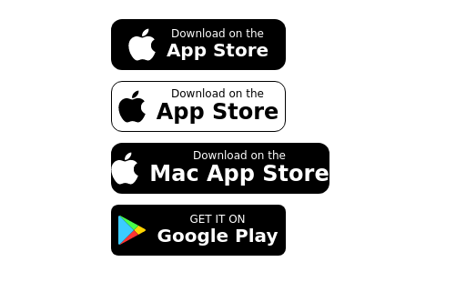
Store buttons (apple,google play)
apple, google play store buttons
15.9k -
Tab Menu
Tab menu
7.2k -
Interactive Toggle Switch with Smooth Animation
A stylish toggle switch component built with Tailwind CSS and enhanced with minimal JavaScript. This toggle switch features smooth color transitions, dynamic text ("ON/OFF"), and a moving indicator ball, providing a visually appealing and functional design. Ideal for modern web interfaces where toggling functionality is required. Easily customizable for various use cases.
2.4k -
Responsive Sign-Up Form with TailwindCSS
Create a visually appealing and fully responsive sign-up form using TailwindCSS. This form includes input fields for full name, mobile number, email, password, and confirm password, along with a gradient sign-up button. Designed with simplicity and flexibility, it is perfect for modern web applications and easy to integrate into any project.
1.8k -
Applications Showcase
This is a stylish and interactive application showcase component designed for web use. It features the following elements: Background Styling: The main container has a rounded-rectangle shape (rounded-3xl) with a subtle white base overlaying a high-resolution background image, styled with background-size: 600px for an artistic touch. The image itself dynamically serves as a backdrop, giving the component a layered appearance. Main Icon: A small circular icon, located at the top-right corner, appears with smooth hover effects: Enlarges to double its size (scale-[2]). Rotates (rotate-[410deg]). Moves diagonally upwards-right (translate-x-3, -translate-y-3). These transitions occur over a duration of 1 second (transition duration-1000). Overlay Gradient: A transparent gradient overlay (bg-gradient-to-l) adds a polished depth effect, transitioning from black (from-black/80) to lighter shades. App Icon and Info: Icon: The app icon is a smaller, bordered square image (rounded-2xl) with hover shrink animations (group-hover:scale-95). Text: A bold application title (text-md font-semibold) with hover-animated underline effects that gradually expand from left to right. A short app description styled as secondary text. Call-to-Action Button: Below the card is a subtle, rounded button (rounded-full) encouraging interaction. It features: A hover effect with color inversion (gray to black). A lift effect (hover:-translate-y-1) when hovered. This component is perfect for modern app showcases, offering a dynamic, user-friendly visual experience. It ensures a professional look while engaging users through smooth animations and clear calls to action.
3.5k -
Call to Action (for app stores)
Download app section with Playstore and Appstore button
12.2k -
Login Form
Login Form
2.7k -
Gradient Button
These buttons use a style that includes two contrasted colors creating an impressive mesh gradient effect.
4.9k -
Home page 2
Отзывчивый логотип по центру. Интерактивные кнопки призыва к действию.
1.4k
Browse by topic
Explore components by Tags
Jump straight to the UI pattern you need.
Can't find it?
Didn't find the component you were looking for?
Search across 3,000+ community-built components and grab the code in seconds.