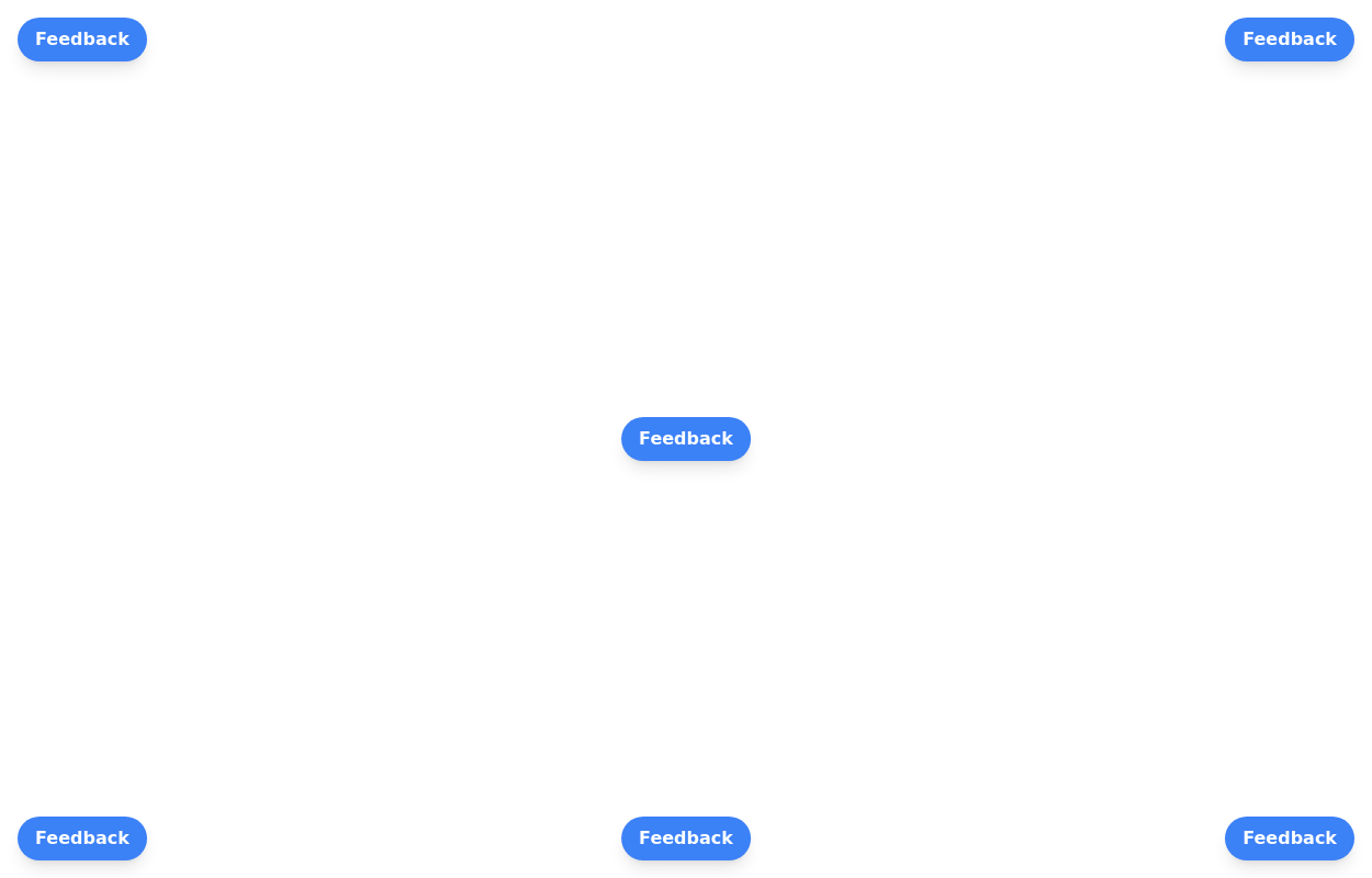
Button
Material Button
This tailwind example is contributed by Akram Khan, on 11-Sep-2024. Component is made with Tailwind CSS v3. It is responsive.

Author Akram Khan
Related Examples
-
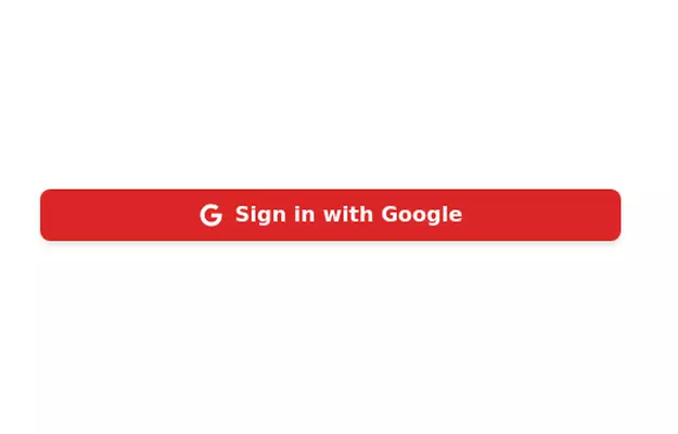 3 years ago10.6k
 -
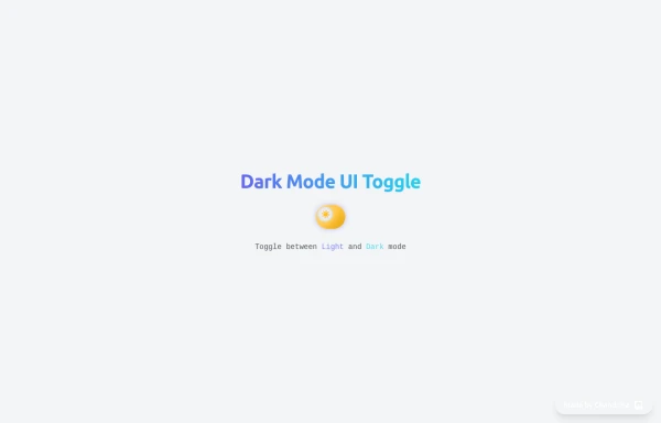 Animated Light/Dark Mode Toggle
👉🏻3D glow effects on knob & track 👉🏻Gradient transitions that look holographic 👉🏻Animated pulse when active 👉🏻Dark background gradient instead of a flat color 👉🏻Emoji swap (☀️ → 🌙)
5 months ago426 -
 Ripple Button
Ripple Button is an interactive button component with a ripple animation that responds to user clicks
2 years ago13.6k -
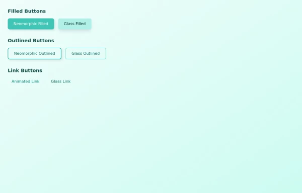 buttons group
some attractive button group on different varients primary, outlined and link button
1 year ago1.8k -
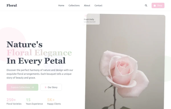 flower
by salvator
9 months ago1.4k -
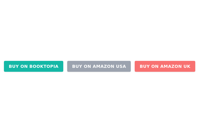
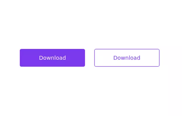 Primary and secondary button pair
Call to action buttons
3 years ago17k -
 3 years ago15.4k
 -
 Social buttons
Mono-color Social buttons change colors according to your need
3 years ago12.2k -
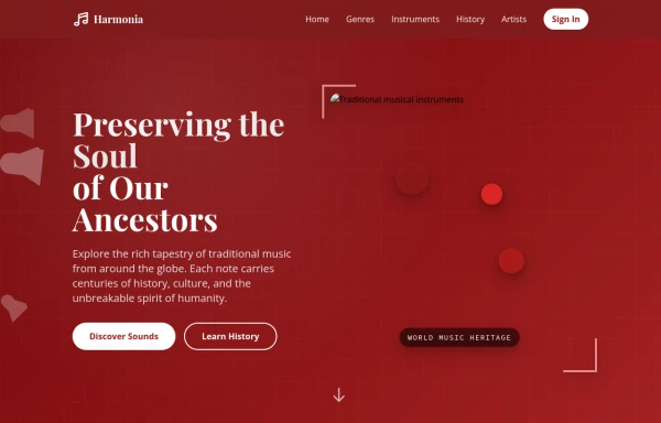 tradition music
by salvator
9 months ago873 -
 Floating buttons examples
Bottom-Right Corner, Bottom-Left Corner, Top-Left Corner, Top-Right Corner, Center, Bottom-Center
2 years ago25.9k -
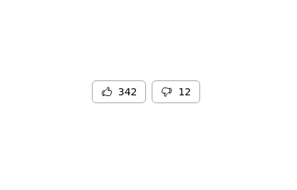 Thumbs up and thumbs down buttons
Upvote downvote buttons
2 years ago11.9k -
 3 years ago10.1k


Explore components by Tags
Didn't find component you were looking for?
Search from 3000+ components