Call to action section
This tailwind example is contributed by Odessa Young, on 02-May-2023. Component is made with Tailwind CSS v3. It is responsive. It supports dark mode. similar terms for this example are CTA,banner

Author Odessa Young
Related Examples
-
 Call to example
Call to example using radial-gradient
3 years ago8.8k -
 Join Our Community Banner
Encourage users to become members of a community.
2 years ago8.6k -
 3 years ago15.4k
 -
 Blog post card
Responsive blog post or article card. This card can also be used as a CTA
2 years ago10.8k -
 3 years ago14.1k
 -
 3 years ago11.8k
 -
 Call to action
slightly tilted call to action section
3 years ago11.4k -
 Call to Action section
CTA with clear message and big button
2 years ago4.7k -
 3 years ago15.4k
 -
 Domain For Sale Template
Domain For Sale Template
2 years ago4.3k -
 Banner for app download
Show App Download Buttons for the App Store and Play Store
1 year ago1.9k -
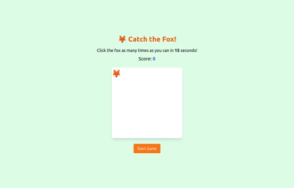 an off line game of catching afox
an off line game of catching afox
9 months ago787


Explore components by Tags
Didn't find component you were looking for?
Search from 3000+ components