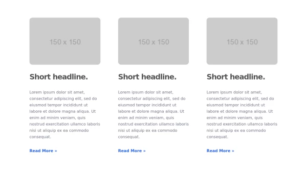
masonary grids effect for cards using columns
As part of the redesign I was trying to think of ways to lay out testimonials from students, which may have varying length/content, I stumbled onto the idea of using a masonry layout (think bricks, think Pinterest).
This tailwind example is contributed by rohit whyphy, on 03-Mar-2025. Component is made with Tailwind v3.4. It is responsive. similar terms for this example are endorsement,review

Related Examples
-
-
 Responsive Card Grid
Tailwind CSS responsive grid for feature listing. The cards have a teal background, rounded corners, and a concise display of feature titles, descriptions, and a "Learn More" link.
53.8k -

-

-
 Products card grid
Example of product card grid with product image and pricing
24.8k -
 Info cards
Show various statistics on your website
12k -
 Customer testimonial card
Responsive user testimonial card with image
12.7k -

-
 10.8k
10.8k -

-

-
 Blog post cards
responsive blog post cards
13.4k





Browse by topic
Explore components by Tags
Jump straight to the UI pattern you need.
Can't find it?
Didn't find the component you were looking for?
Search across 3,000+ community-built components and grab the code in seconds.