Underline Hover Effect
Hover effect using after and before pseudo elements.
This tailwind example is contributed by Carlos Adrian Garcia, on 24-Jan-2024. Component is made with Tailwind CSS v3.

Author Carlos Adrian Garcia
Related Examples
-
3 years ago11.5k
-
 2 years ago16.7k
 -
 Sharp corner button design
button with hover effect
3 years ago12.7k -
Canlı Yayın Butonu
Pulse efekt içeren canlı yayın butonu.
1 year ago1.9k -
 Game changer
by salvator
9 months ago1.1k -
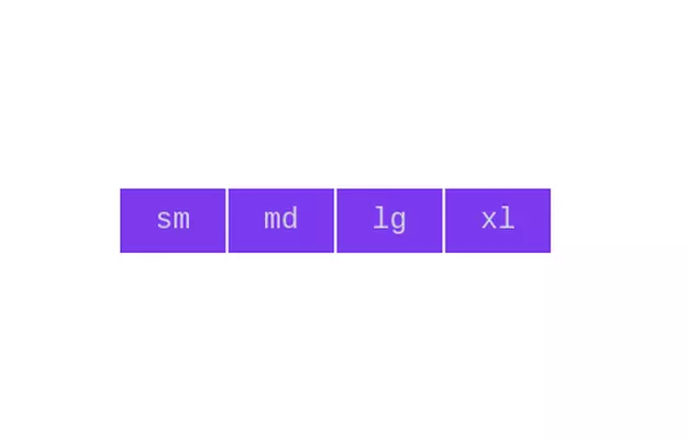 Button group
Add active class to clicked button using JavaScript
3 years ago10.8k -
 1 year ago1.7k
 -
Plug and Play Animated Button for Hero Statements / Landing Pages
REMOVE the bg-black from the outside <button/> div, if you are already using a black background. Besides this, the button is plug and play! Know errors: You may need to remove animate-spin for your usecase, depending on framework rendering. For SvelteKit, animate-spin is NOT needed. But the [animation:spin_4s]... is always necessary for a smooth effect. Check out my profile to join my community online or add me on LinkedIn.
1 year ago2k -
 1 year ago3k
 -
Glowing gradient button
Button on black background
3 years ago39.5k -
 3 years ago11k
 -
Button With Loader
Tailwind Loader
1 year ago3k


Explore components by Tags
Didn't find component you were looking for?
Search from 3000+ components