Button With Loader
Tailwind Loader
This tailwind example is contributed by Md. Tofayel islam, on 15-Mar-2024. Component is made with Tailwind v3.4. It is responsive. It supports dark mode. similar terms for this example are loading, loader

Related Examples
-
20.2k
-
Tailwind spinner
loading spinner component
40.5k -
Loading dots
Black Loading dots
40.7k -
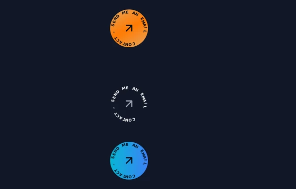 Contact Spinner
Contact button spinning
6.5k -
Animated Title
App Logo or Main Title
7.6k -
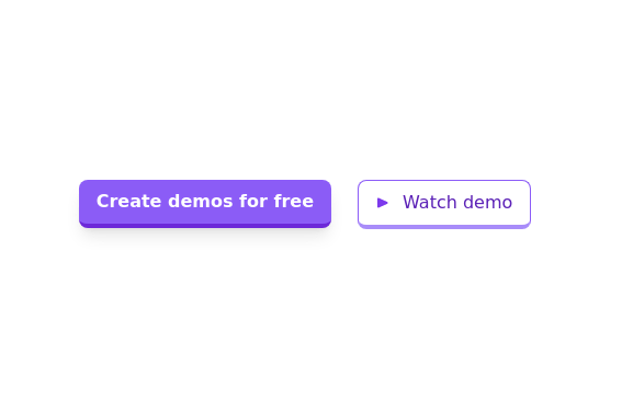 Call to action buttons
Pair of active primary and secondary buttons. Elevated buttons w/ border bottom
10.5k -
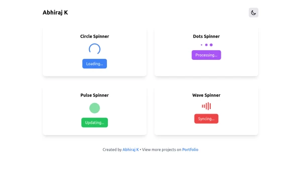 Spinner
The Spinner is a simple and visually appealing component that indicates ongoing processes like loading or data fetching. It's a great way to improve user engagement and reduce frustration during wait times. Different styles and animations (circular, dots, pulsating). Customizable size, color, and speed. Easy to integrate with loading states in any app. Lightweight and responsive.
2.5k -
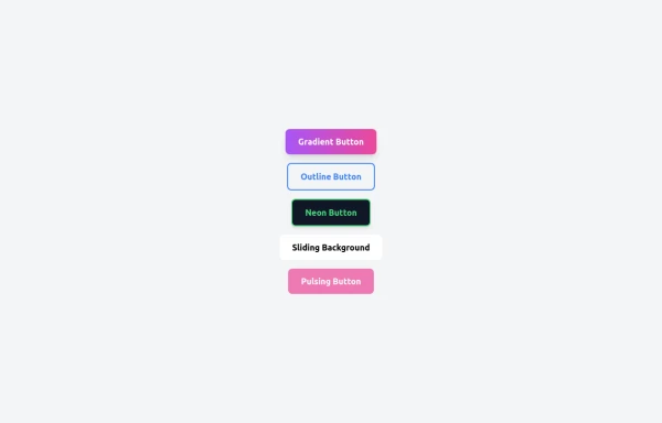 5 Different Style of Button
Gradient Button outline button neon button Sliding Background pulsing Button
1.2k -
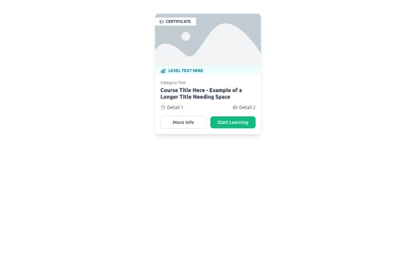 E-Learning Course Card with Badge and Level Indicator
An HTML and Tailwind CSS component mockup for displaying course information. Features include a placeholder image area with an overlaid certificate badge, a distinct level indicator banner below the image, category text, a course title, key details (like duration and learner count placeholders), and primary/secondary action buttons. Designed for e-learning platforms or course listings.
1.6k -
 2.6k
-
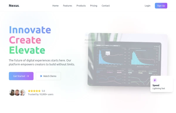 Modern page
hero page by salvator
1.9k -
 10.4k










Browse by topic
Explore components by Tags
Jump straight to the UI pattern you need.
Can't find it?
Didn't find the component you were looking for?
Search across 3,000+ community-built components and grab the code in seconds.