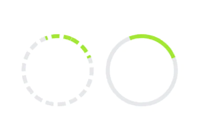
Spinner with card
Use this animated loading indicator when content inside of a card is still loading.
This tailwind example is contributed by Md. Tofayel islam, on 20-Mar-2024. Component is made with Tailwind CSS v3. It is responsive. It supports dark mode. similar terms for this example are loading, loader

Author Md. Tofayel islam
Related Examples
-
 3 years ago27.9k
 -
 masonary grids effect for cards using columns
As part of the redesign I was trying to think of ways to lay out testimonials from students, which may have varying length/content, I stumbled onto the idea of using a masonry layout (think bricks, think Pinterest).
11 months ago1.3k -
 Greeting Card with CTA
card with two actions with greeting msg according to time
2 years ago7.9k -
 Profile card
Profile card with social icons
3 years ago13.2k -
 Card kpi Chart
Targetas kpi con graficas
2 months ago391 -
 Tailwind Spinner(Loader)
simple and precise
2 years ago9.5k -
 10 months ago949
 -
 Linkedin Add to your feed Clone
Linkedin Add to your feed Clone
1 year ago3.5k -
 Food Ordering Dashboard
A responsive user interface for selecting and ordering your favorite meals. The dashboard allows users to browse food categories, view dish details, and place orders with ease.
8 months ago1.1k -
 10 months ago1.8k
 -
 1 year ago2.5k
 -
 beautifull Authentication Page
I create a Authentication page using cloude ai model.
1 year ago2.3k


Explore components by Tags
Didn't find component you were looking for?
Search from 3000+ components