Corner‑Framed Hover Transition Buttons
Minimal CTA buttons featuring animated corner shapes and smooth width transitions on hover, built with Tailwind CSS for a sharp, modern UI.
This tailwind example is contributed by Arshid Iqbal, on 13-Aug-2026. Component is made with Tailwind v3.4. It is responsive. similar terms for this example is Transitions

Related Examples
-
 Sharp corner button design
button with hover effect
13.5k -
 Image Card
An image. Shows title and description info when hovering. Image zooms and darkens when hovering.
1.2k -
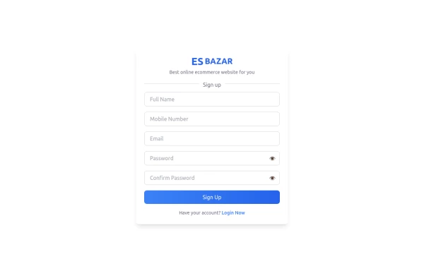 Responsive Sign-Up Form with TailwindCSS
Create a visually appealing and fully responsive sign-up form using TailwindCSS. This form includes input fields for full name, mobile number, email, password, and confirm password, along with a gradient sign-up button. Designed with simplicity and flexibility, it is perfect for modern web applications and easy to integrate into any project.
1.8k -
 Button Dropdown
Drop down button with only tailwind css using focus
2.6k -
 Continue with Social Login - Continue with Google, LinkedIn, Twitter, Facebook, GitHub, Apple
Streamline your account creation and login process. Use our secure social login buttons to quickly sign in or register using your existing Google, LinkedIn, Twitter, Facebook, GitHub, or Apple account.
922 -

-
 producer
to working songs and films
1.4k -

-
 Call to Action (for app stores)
Download app section with Playstore and Appstore button
12.2k -
 Download App Buttons
Ready-to-use Apple App Store and Google Play Store download buttons with official branding and styling
855 -
Canlı Yayın Butonu
Pulse efekt içeren canlı yayın butonu.
2.5k -





Browse by topic
Explore components by Tags
Jump straight to the UI pattern you need.
Can't find it?
Didn't find the component you were looking for?
Search across 3,000+ community-built components and grab the code in seconds.