Our services component
This tailwind example is contributed by Anonymous, on 12-Jul-2024. Component is made with Tailwind CSS v3. It is responsive. similar terms for this example are Services,Why choose us

Author Anonymous
Related Examples
-
 1 year ago3.1k
 -
 2 years ago14.4k
 -
 Feature: Switch-Special
Here a special feature-showcase. I hope you like it ;)
1 year ago1.7k -
 1 year ago7k
 -
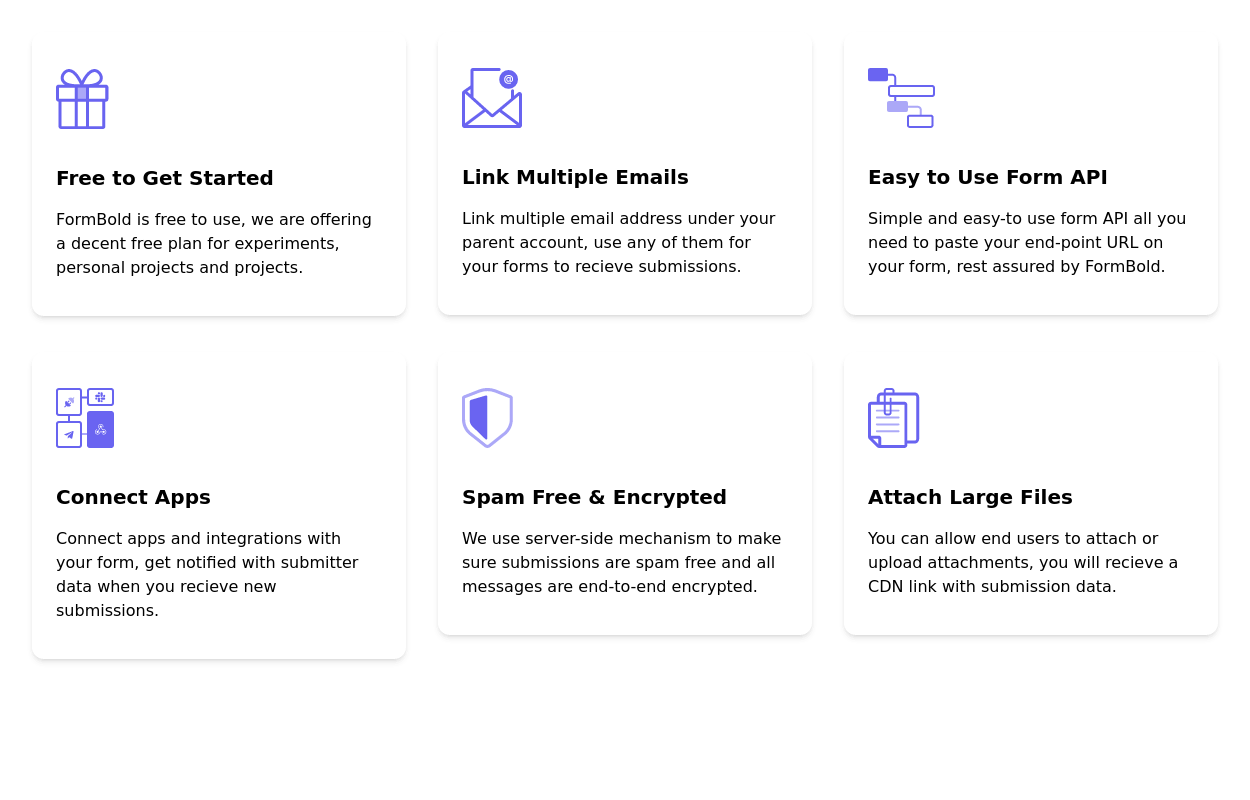
 Feature Cards Section
showcase key features or benefits with cards.
2 years ago4k -
 3 years ago11.2k
 -
 Features showcase section
showcase key features and benefits
2 years ago7.4k -
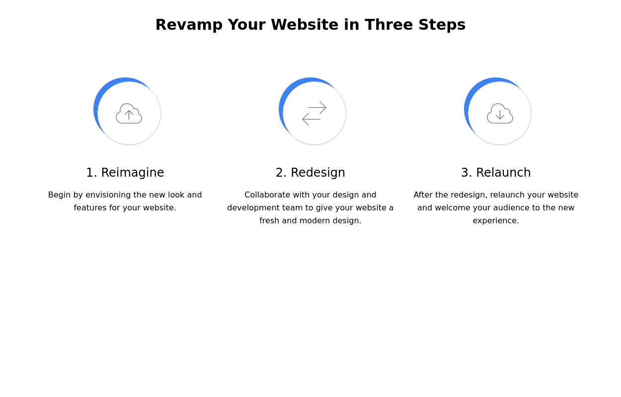 Steps section
Show features or steps of your website. Each step Includes Icons.
2 years ago9.8k -
 3 years ago14.2k
 -
 3 years ago11.3k
 -
 3 years ago20k
 -
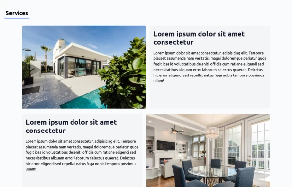 House Cleaning Website Services Section
House Cleaning Website Services Section Photo by @candjstudios & @framesforyourheart on Unsplash
1 year ago7.6k


Explore components by Tags
Didn't find component you were looking for?
Search from 3000+ components