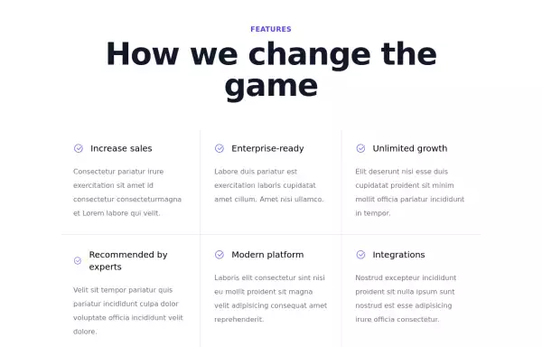
accordion with Tailwind CSS and Alpinejs
This tailwind example is contributed by Michael Andreuzza, on 27-Apr-2024. Component is made with Tailwind CSS v3. It is responsive. similar terms for this example are Services,Why choose us

Author Michael Andreuzza
Related Examples
-
 2 years ago14.3k
 -
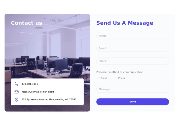 tailwind contact form
tailwind contact form
1 year ago3.4k -
 2 years ago11.2k
 -
 Video Player
Youtube Video Player
6 months ago729 -
 1 year ago5.2k
 -
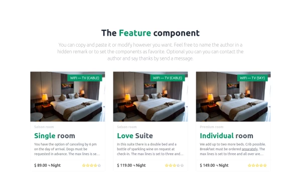 Hotel rooms
A simple room overview
1 year ago1.5k -
-
 2 years ago16.9k
 -
 Showcase
A version of an showcase.
1 year ago1.4k -
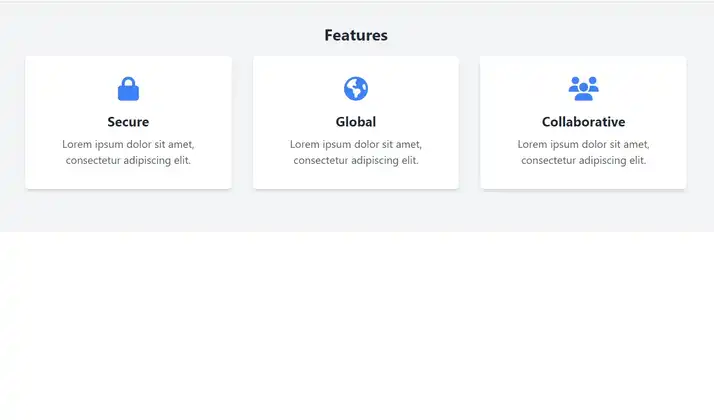
 Attractive Feature Section
With Gradient Color 6 Features
6 months ago811 -
 Showcase Your Services with Interactive Animations: A Modern HTML and Tailwind CSS Example
Discover how to create an eye-catching services section using plain HTML and Tailwind CSS. This modern example features interactive animations that bring your services to life. With smooth hover effects and responsive design, this section is perfect for enhancing your website's user experience. Easily customize the content to fit your needs, and let Tailwind CSS handle the styling and transitions for a polished, professional look.
1 year ago2.7k -
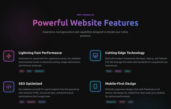 Powerful Website Features
Open Layout Design: No traditional boxes - content flows naturally Gradient Accents: Vibrant color gradients for visual interest Animated Icons: Subtle floating animations on feature icons Hover Effects: Soft glow backgrounds appear on hover Tag System: Color-coded tags for each feature's attributes Dark Theme: Sophisticated dark background with perfect contrast
6 months ago1.1k


Explore components by Tags
Didn't find component you were looking for?
Search from 3000+ components