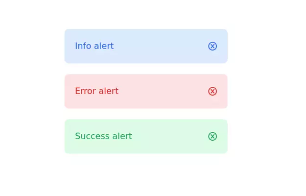
alert
dehgan creator
This tailwind example is contributed by Anonymous, on 26-May-2025. Component is made with Tailwind CSS v3. It is responsive. similar terms for this example is caution

Author Anonymous
Related Examples
-
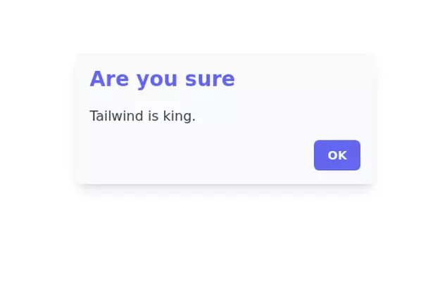
 Alerts
Provide contextual feedback messages for typical user actions with the handful of available and flexible alert messages.
2 weeks ago73 -
 Notifications
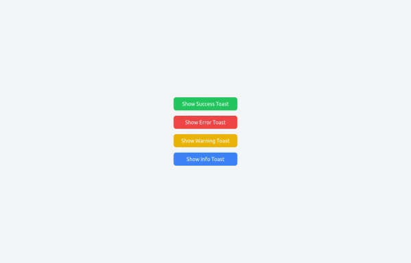
Toast Notifications are lightweight and customizable components for displaying short messages or alerts. They are perfect for feedback on user actions, such as form submissions or system updates. Supports different types of notifications (success, error, warning, info). Automatically hides after a specified timeout. Option to include action buttons or close icons. Customizable styles, animation, and position on the screen.
1 year ago1.4k -
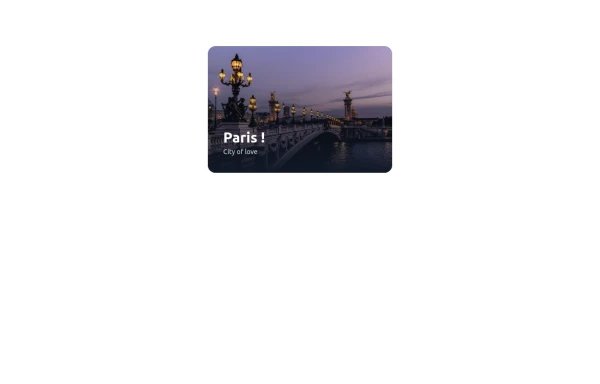
 Beautiful Info card
Info card with info type section on the corner.
3 years ago10.5k -
 3 years ago13.2k
 -
 Fixed alert
fixed top right alert
3 years ago12.1k -
 Commentaires simple
Commentaires
1 day ago1 -
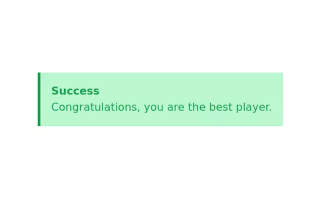
 Notification alert section
Show info, success, or error messages
3 years ago10.9k -
 3 years ago11.6k
 -
 404 Page
The 404 Page is a responsive and customizable error page designed to inform users when they’ve reached a nonexistent or broken link. This component not only improves user experience but also provides a chance to showcase creativity and guide users back to the right path. Key Features: Fully responsive design that works on all devices. Engaging visuals (customizable images, icons, or animations). Includes a message like "Page Not Found" or "Oops! Something went wrong." Provides helpful navigation options such as a "Go Home" button or links to other pages. Easily customizable for themes, styles, and content.
1 year ago2.2k -
 cards
cardshtml , css ,
10 months ago958 -
 3 years ago11.7k
 -
 3 years ago11.3k


Explore components by Tags
Didn't find component you were looking for?
Search from 3000+ components