Alert with big logo
This tailwind example is contributed by _Amar_, on 14-Jul-2022. Component is made with Tailwind CSS v3. similar terms for this example is caution

Author _Amar_
Related Examples
-
 3 years ago11.3k
 -
 2 years ago15k
 -
 Alert mono color
minimal alerts design
3 years ago10.8k -
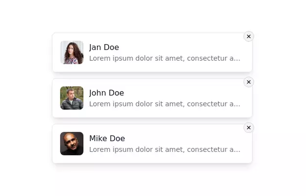 Notification Alert Section
Notification card with close button
3 years ago13.5k -
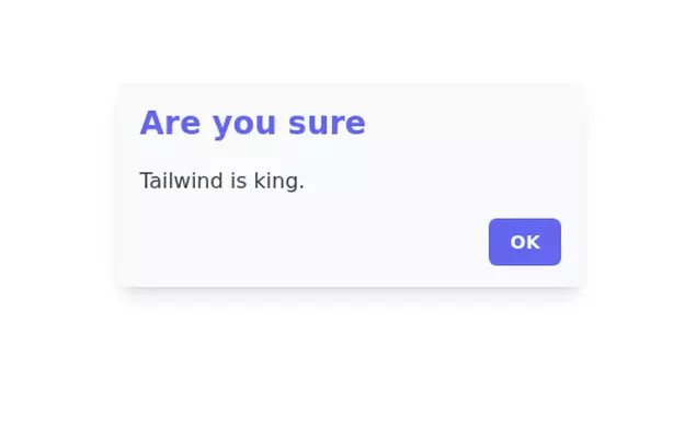
 Alerts
Provide contextual feedback messages for typical user actions with the handful of available and flexible alert messages.
1 week ago25 -
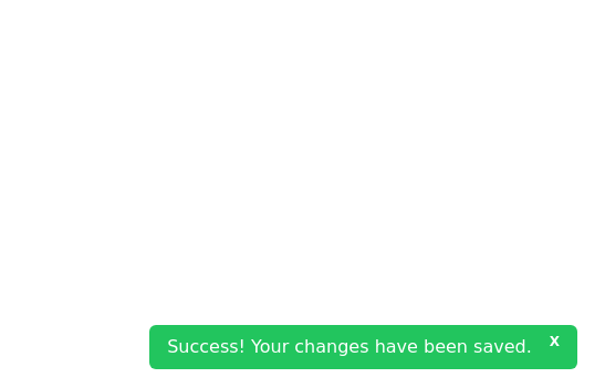 Closable toast message
show notification toast message at the bottom right corner
2 years ago8k -
 Toast Notifications
Visually appealing toast notification component designed with Tailwind CSS
1 year ago1.2k -
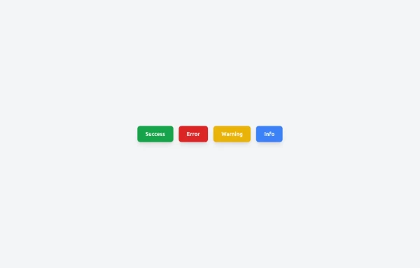
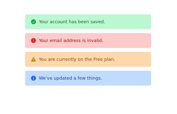
 Succes Warning Error Toast Designs.
Succes Warning Error Toast Designs.
1 year ago2.1k -
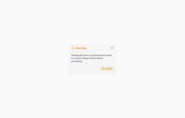 Confirmation Modal for Critical Actions
A clean and responsive warning dialog component built with Tailwind CSS. Includes a title, descriptive text, and action buttons for confirmation or cancellation of critical actions.
6 months ago724 -
 2 years ago14.3k
 -
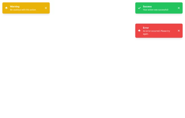
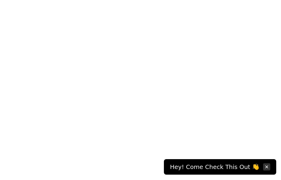 Floating dismissible notification
bottom right floating alert
3 years ago13.6k -
 3 years ago13.2k


Explore components by Tags
Didn't find component you were looking for?
Search from 3000+ components