Taskify Premium Task Management FREE
Website Task management modern and responsif
This tailwind example is contributed by Alif Bima Pradana, on 07-Feb-2026. Component is made with Tailwind v3.4. It is responsive. It supports dark mode. similar terms for this example are Admin Dashboard, User dashboard

Related Examples
-
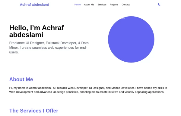 Responsive portfolio with dark mode
responsive and support dark mode .portfolio website
4.6k -
 Sidebar
This is the sidebar that I use in my projects, I use grid to be able to manage the space issue a little better, it seems like a clean and modern design, it is more than anything for the dashboards that you want to create
4.7k -
 canvas fully covers
5.1k -
-
 chat ui advanced
Professional chat ui, connect me for jsx https://abhirajk.vercel.app/
2.5k -
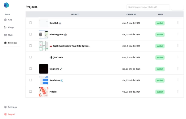 Table Content
Dashboard Table Content, with Sidebar Reusable for any window
-
 DailyDev Card
Card -based card used in the Dailydev Card, this is created to be modified to taste of each user
2.4k -
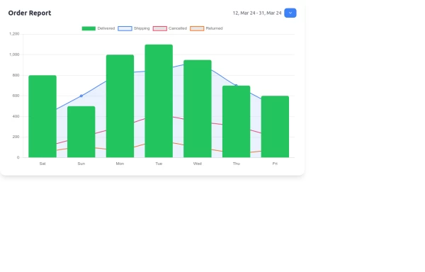 Interactive Order Report Chart with TailwindCSS and Chart.js
Create a stunning and interactive order report chart using HTML, TailwindCSS, and Chart.js. This chart combines bar and line graphs to visualize delivered, shipping, cancelled, and returned orders effectively. Perfect for dashboards and analytics pages with responsive design and clean aesthetics.
2.5k -
 Table CRUD
CRUD TABLE DESIGN
5.1k -
 Adminpanel
Three tabs, switch between each other, change color when clicked. Tables with filter, search, with a drop-down form to fill.
2.1k -
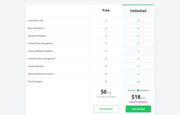 Comparison Pricing Table Component
A responsive pricing table built with HTML and Tailwind CSS, comparing two plans (Free and Unlimited) with a clear feature checklist. Includes distinct styling for the premium plan and a toggle for monthly/annual pricing display.
2.1k -
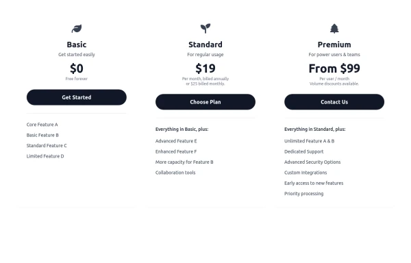 Responsive 3-Tier Pricing Card Section
A clean and responsive pricing table component featuring three distinct tiers (e.g., Basic, Standard, Premium) presented in a card layout. Built with HTML and Tailwind CSS, it stacks vertically on small screens and transitions to a side-by-side view on medium screens (md breakpoint - 768px) and up. Each plan card includes a placeholder icon, title, description, price details, a call-to-action button, and a bulleted list of features with checkmarks. The generic content makes it easy to adapt for various websites or applications needing a clear pricing comparison structure.
983



Browse by topic
Explore components by Tags
Jump straight to the UI pattern you need.
Can't find it?
Didn't find the component you were looking for?
Search across 3,000+ community-built components and grab the code in seconds.