Gridaient Card Information Section
a card in neon design
This tailwind example is contributed by Akram Khan, on 13-Sep-2024. Component is made with Tailwind CSS v3. It is responsive.

Author Akram Khan
Related Examples
-
 Profit Card
Profit card with deatils
1 year ago2.2k -
 1 year ago2.6k
 -
 2 months ago161
 -
 opulent
this a page didicated for laptops,phones using tailwindcss
10 months ago1.2k -
 Services
Card Services Section. find it makecomponents.com
1 year ago2.3k -
 Cards
Cardsthe best tailwind cards with responsive
10 months ago971 -
 Animated Ripple Avatar
Ripple Effect Avatar (Tailwind CSS Component) A visually striking animated component that displays a centered avatar or image surrounded by expanding ripple circles. Built with Tailwind CSS and custom animations, this effect simulates a pulsing or water ripple reaction, drawing attention to the central image. Ideal for user profile sections, hero banners, landing pages, or highlighted features in modern web interfaces. The ripples gradually fade and expand, creating a soft, calming motion that enhances interactivity and depth.
10 months ago1.3k -
 Animated Info Card
Animated info card
1 year ago1.4k -
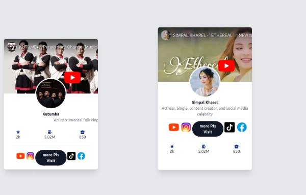
 Trending Users
Tailwind Flex Trending Users Card Design
1 year ago4.2k -
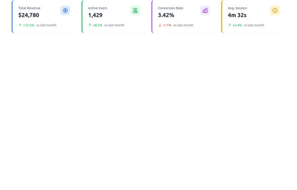 Dashboard Stats Widget
Here’s a sleek Stats Widget built with Tailwind CSS that you can sell on TailwindFlex. It includes animated hover effects, trend indicators, and responsive design.
10 months ago1.8k -
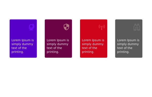
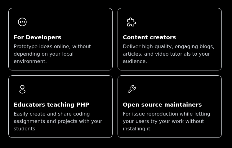 Features cards section
Features cards section with dark theme
3 years ago10.6k -
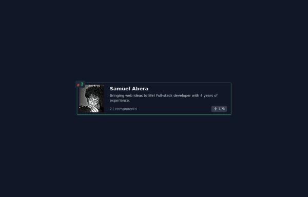
 Card profile
profile card
2 years ago2.9k


Explore components by Tags
Didn't find component you were looking for?
Search from 3000+ components