cards
group of cards
This tailwind example is contributed by TakaMorY, on 10-Aug-2025. Component is made with Tailwind CSS v3. It is responsive.

Author TakaMorY
Related Examples
-
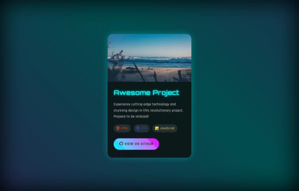
 Futuristic 3D Tilt Card
Hover to see the 3D effect
1 year ago3.1k -
 Linkedin Add to your feed Clone
Linkedin Add to your feed Clone
1 year ago3.5k -
 1 year ago2.4k
 -
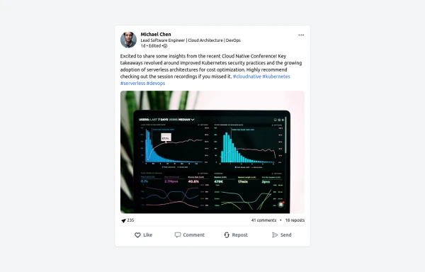 LinkedIn Post UI Mockup
A static HTML and Tailwind CSS component designed to replicate the user interface of a LinkedIn post. This mockup accurately represents the post structure including the header (avatar, name, headline, timestamp), content area (text, optional media), engagement statistics (likes, comments, reposts), and the action bar (Like, Comment, Repost, Send). It's fully responsive, supports light and dark themes, and uses appropriate iconography and styling to closely mimic the LinkedIn feed experience.
10 months ago1.3k -
 3 years ago11.1k
 -
 3 years ago16.1k
 -
 2 months ago151
 -
 Services
Card Services Section. find it makecomponents.com
1 year ago2.2k -
 Weather card
Component was one shot generated using https://inspi.me
1 month ago367 -
 1 year ago1.2k
 -
 Form
Formform
1 year ago2.1k -
 MENU OMERLINKS
MENU OMERLINKS
1 month ago142


Explore components by Tags
Didn't find component you were looking for?
Search from 3000+ components