Premium Tailwind CSS Card Component
Discover this elegant premium card component built with Tailwind CSS featuring the Poppins font. This modern, responsive design features glassmorphism effects, gradient borders, smooth animations, and a sophisticated color scheme, making it ideal for showcasing premium products or services.
This tailwind example is contributed by CodewithFaraz, on 04-Sep-2025. Component is made with Tailwind v3.4. It is responsive.

Related Examples
-
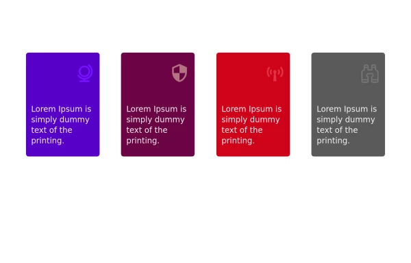 Services
Card Services Section. find it makecomponents.com
2.7k -
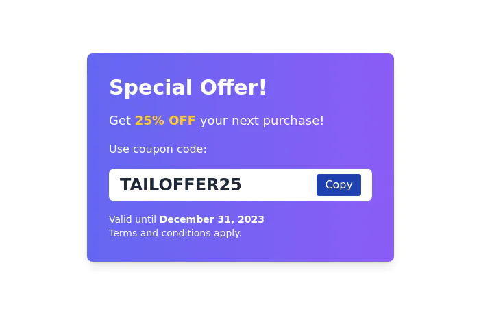 Coupon code card
Display Special Offer with Coupon Code
11.7k -
 2.4k
2.4k -
 1.9k
1.9k -
-
 1.1k
1.1k -
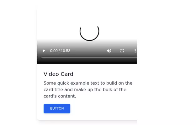 Video card
Video card component for tailwind css
18.3k -
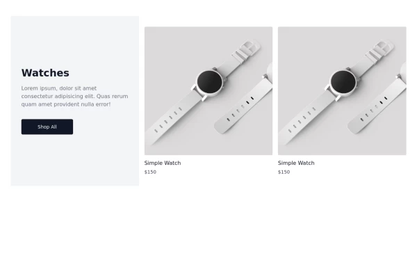 Watch Card
Watch Cards
2.8k -
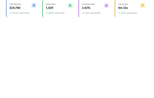 Dashboard Stats Widget
Here’s a sleek Stats Widget built with Tailwind CSS that you can sell on TailwindFlex. It includes animated hover effects, trend indicators, and responsive design.
2.4k -

-
 Card with full width image
centered content
10.6k -
 Coming Soon Section
Simple and beautiful card for your showing on your projects (in development) home screen
11.5k










Browse by topic
Explore components by Tags
Jump straight to the UI pattern you need.
Can't find it?
Didn't find the component you were looking for?
Search across 3,000+ community-built components and grab the code in seconds.