card
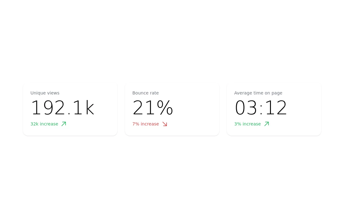
card section. find it makecomponents.com
This tailwind example is contributed by makecomponents, on 24-Aug-2024. Component is made with Tailwind v3.4. It is responsive.

Related Examples
-
-
-

-
 carde avec effet apple
carde avec effet apple
764 -
 Latest Blog Card Components
Stay ahead of the curve with fresh content on code, design, startups, and everything in between.
-
-
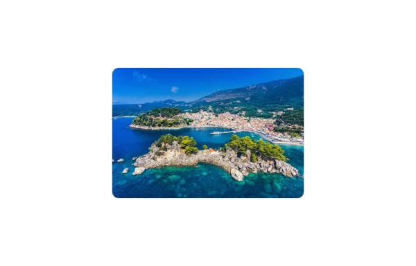 Image Card
An image. Shows title and description info when hovering. Image zooms and darkens when hovering.
1.2k -
 3D Modern Pricing Card
Here's a modern, reusable Pricing Card component that's highly popular on platforms like TailwindFlex. It's clean, responsive, and designed for conversions.
1.3k -
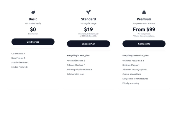 Responsive 3-Tier Pricing Card Section
A clean and responsive pricing table component featuring three distinct tiers (e.g., Basic, Standard, Premium) presented in a card layout. Built with HTML and Tailwind CSS, it stacks vertically on small screens and transitions to a side-by-side view on medium screens (md breakpoint - 768px) and up. Each plan card includes a placeholder icon, title, description, price details, a call-to-action button, and a bulleted list of features with checkmarks. The generic content makes it easy to adapt for various websites or applications needing a clear pricing comparison structure.
982 -
 Portfolio with buttons
Portfolio with buttons. Portfolio item has image, title and description.
4.8k -
 Profile Card
User profile card
558 -
 Linear dinamique section by Raul antonio de la cruz hernandez remix omerlinx responsive
Linear dinamique section by Raul antonio de la cruz hernandez remix omerlinx responsive






Browse by topic
Explore components by Tags
Jump straight to the UI pattern you need.
Can't find it?
Didn't find the component you were looking for?
Search across 3,000+ community-built components and grab the code in seconds.