beautifull project Item
This tailwind example is contributed by Akram Khan, on 07-Jul-2024. Component is made with Tailwind CSS v3. It is responsive.

Author Akram Khan
Related Examples
-
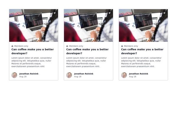 Responsive card grid
responsive card grid for articles
3 years ago15.9k -
 1 month ago257
 -
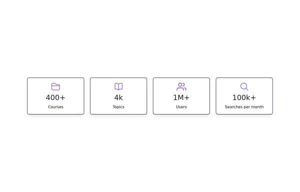 Stats card with icons
Improved Code quality and added support for dark mode
1 year ago1.8k -
 Professional Plan
Professional Plan
8 months ago428 -
 Card with Thumbnail
Post card with image
3 years ago11.5k -
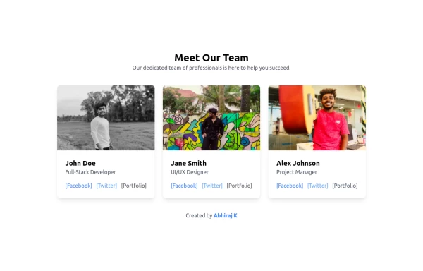 Team Members Showcase with Portfolio Backlink
Showcase your team's talent with this beautifully designed and responsive team members grid. Each card includes the member's photo, name, role, and social links. A special portfolio backlink is included to highlight your personal contributions as a developer. Supports light and dark modes.
1 year ago1.9k -
 Customer testimonial card
Responsive user testimonial card with image
3 years ago12.1k -
 3 years ago15.1k
 -
 Tailwind AoPS Demo - Isabel
Starter code for an interactive Tailwind Demo
1 year ago2.7k -
 1 year ago2.9k
 -
 Feature Card
Shows off a feature, great for homepages and grid layout, or can be used in dashboards for "example use" grids. Enjoy! Part of the Coastal UI collection.
10 months ago401 -
 3 years ago13.6k


Explore components by Tags
Didn't find component you were looking for?
Search from 3000+ components