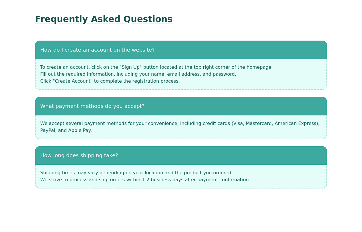
FAQ Section
This tailwind example is contributed by Abdul Baset Bappy, on 19-Jun-2025. Component is made with Tailwind CSS v3. It is responsive. similar terms for this example are Frequently asked questions, QnA

Author Abdul Baset Bappy
Related Examples
-
 Free SEO Audit & Analysis Tool
Instant SEO analysis of your website. Check 50+ ranking factors including on-page SEO, technical issues, and mobile performance.
4 months ago434 -
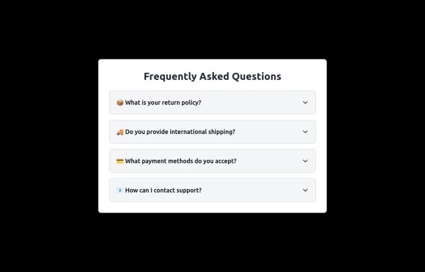
 FAQ cards
FAQ section with cards
2 years ago14.2k -
 FAQs
FAQsThis is a FAQ it is made using html and tailwindcss
9 months ago924 -
 FAQ with dropdown
Created by Surjith S M -> https://twitter.com/surjithctly This component does not use javascript for dropdown
2 years ago18.1k -
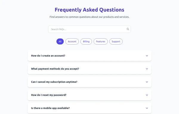
 Frequently Asked Questions
A beautiful and modern accordion FAQ component using HTML & Tailwind CSS with smooth animations.
1 year ago1.7k -
 3 years ago12.4k
 -
 for qution and answer
this is i made for qution and ans and referense from etsnote.com
1 year ago2.3k -
 8 months ago1.4k
 -
 1 year ago5.6k
 -
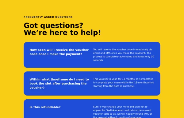
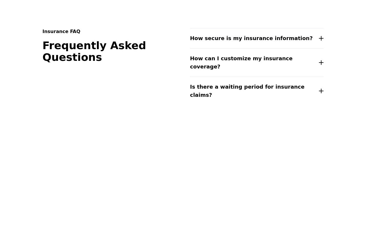 Accordion FAQ
quick and easy access to frequently asked questions related to insurance. It allows users to expand and collapse questions with answers.
2 years ago10.2k -
 11 months ago1.8k
 -
 2 years ago15.6k


Explore components by Tags
Didn't find component you were looking for?
Search from 3000+ components