- Home
-
Feeds
Feeds
This is a responsive social media feed interface built with Tailwind CSS that features a clean, modern design with excellent color contrast and visual hierarchy. Here's a detailed breakdown of its components and layout:
This tailwind example is contributed by ishimwe shadad, on 22-May-2025. Component is made with Tailwind CSS v3. It is responsive.
Author ishimwe shadad
Related Examples
-
1 week ago38
-
Flex and Flex-Col
วิธีการใช้ Flex และ Flex-Col
7 months ago648 -
1 year ago4k
-
Interactive Multi-Method Donation Section
Overview: A high-trust, conversion-oriented fundraising section styled in the project's signature Navy Blue theme. It provides users with flexible payment options, ranging from one-click fixed amounts to manual bank transfers and cryptocurrency donations. Key Features: Smart Amount Logic: Includes a JavaScript-powered selector where users can choose a preset amount ($10, $25, $50) or type a custom value. The interface automatically toggles states (deselecting buttons when typing, and vice-versa) to prevent user error. Payment Methods: Quick Card/Checkout: Primary call-to-action column. Bank Transfer: A clean card displaying account details with a "Copy to Clipboard" utility. Crypto (Bitcoin): A specialized dark-themed card featuring a placeholder QR code and wallet address copying functionality. Trust Signals: Includes security iconography (lock, shield) and reassuring copy to boost donor confidence. Visual Hierarchy: Uses a 7/5 grid split to prioritize the immediate donation action while keeping manual payment methods accessible but secondary. Tech Stack: Framework: Tailwind CSS. Icons: Ionicons. Scripting: Vanilla JavaScript (for amount toggling and clipboard copying functions). Fonts: DM Serif Display (Headings) + Inter (Body). Usage: Ideal for the "Support Us" page or a dedicated campaign landing page. The script tag included at the bottom handles all the interactivity (button selection and text copying) without needing external libraries.
3 months ago450 -
5 months ago735
-
trusted by
1. Color Scheme: 1. Updated the background to a gradient from Indigo-800 to Blue-900 2. Changed text colors to use Indigo-800 and Blue-900 shades 3. Updated ring colors on avatar images to match the new scheme 2. Enhanced Design: 1. Added a containing card with white background (dark gray in dark mode) 2. Increased the size of avatar images for better visibility 3. Added a shadow effect to the card that changes color on hover 3. Responsiveness: 1. Maintained the responsive layout, stacking vertically on smaller screens 4. Animations and Interactions: 1. Added a fade-in animation for the entire component 2. Enhanced hover effects on avatar images (scale and z-index change) 3. Added a ring effect on hover for each avatar 5. Accessibility: 1. Maintained alt text for images 2. Ensured proper color contrast for text readability 6. Dark Mode: 1. Implemented dark mode support 2. Adjusted colors and ring effects for dark mode 7. Additional Enhancements: 1. Increased font sizes for better readability 2. Added font weight variations to emphasize important text 3. Improved spacing and alignment This updated component maintains the original functionality while incorporating the Indigo-800 and Blue-900 color scheme and adding enhanced visual effects and interactions.
1 year ago1.9k -
machine
A fully interactive, web-based macOS-style desktop environment featuring draggable and resizable windows, a dynamic Dock with magnification, smooth glass UI effects, adaptive colors, a functional photo gallery with hover menus, and integrated mini-apps like Safari, Notes, Weather, and App Store. Built using HTML, CSS, Tailwind, and JavaScript to recreate a modern OS experience directly in the browser.
4 months ago350 -
8 months ago640
-
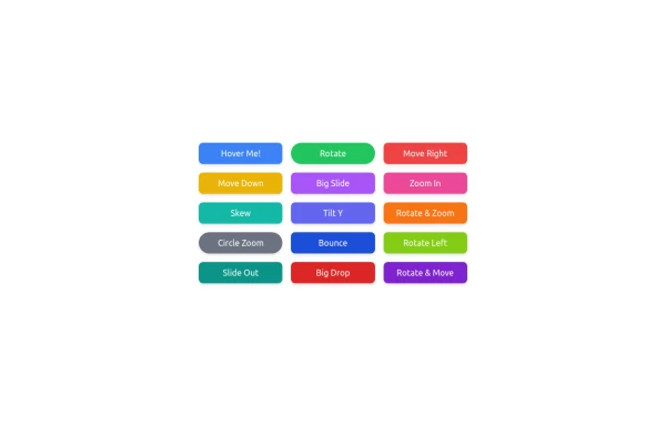
button animation
button animation big
10 months ago1k -
Atlas AI Analyst Workspace
A premium, document-centric AI chat interface that moves beyond standard bubbles into a professional "editor" layout. Designed for power users, it features a floating glassmorphic command bar, a dedicated "Memory & Context" sidebar with interactive widgets, and rich data visualization blocks. The aesthetic combines a deep charcoal base with luxury bronze/orange accents, making it ideal for high-end SaaS tools, financial analysis dashboards, or enterprise AI assistants.
2 months ago129 -
Calculator
This calculator uses CSS although it can be passed directly to tailwind
1 year ago2.2k -
1 year ago1.5k
Explore components by Tags
Didn't find component you were looking for?
Search from 3000+ components


