Social Media Icons
Social Media Icons
This tailwind example is contributed by Aman kumar, on 28-Jun-2024. Component is made with Tailwind CSS v3. It is responsive. similar terms for this example are Social media links,

Author Aman kumar
Related Examples
-
 Social Media Icons
Social Media Icons
1 year ago2.7k -
 Social Media Icons
Social Media Icons
1 year ago2.1k -
 Social Media Icons
Social Media Icons
1 year ago2.4k -
 Social Media Icons
Social Media Icons
1 year ago2.1k -
 4 months ago451
 -
 1 year ago2.4k
 -
 Overlapped icons showcase
Al pasar el cursor sobre el ícono apilado, se revela el ícono completo. Hovering over the stacked icon unveils the complete icon.
1 year ago2.4k -
 Logo cloud of customers
Showcase your customers along with their logos.
1 year ago3.1k -
1 year ago2.8k
-
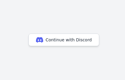
Continue with Discord button
Login with the Discord button for social login
1 year ago3.1k -
 Continue with Discord button
Login with the Discord button for social login
2 years ago12.9k -
 11 months ago1.6k


Explore components by Tags
Didn't find component you were looking for?
Search from 3000+ components