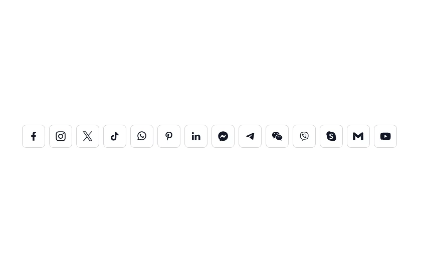
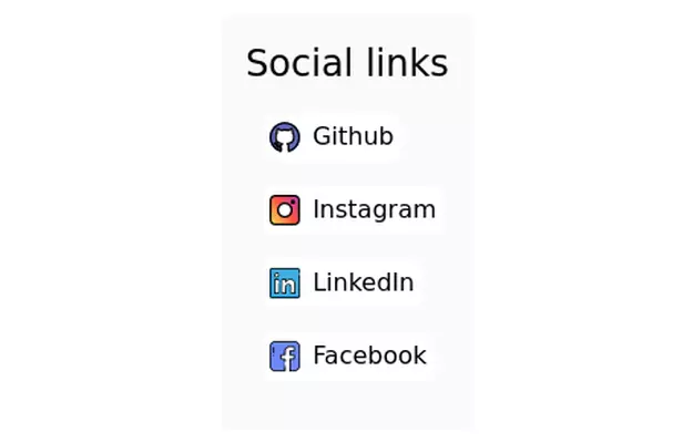
Social Media Icons
Social Media Icons
This tailwind example is contributed by Sedat Kumcu, on 13-Nov-2024. Component is made with Tailwind CSS v3. It is responsive. similar terms for this example are Social media links,

Author Sedat Kumcu
Related Examples
-
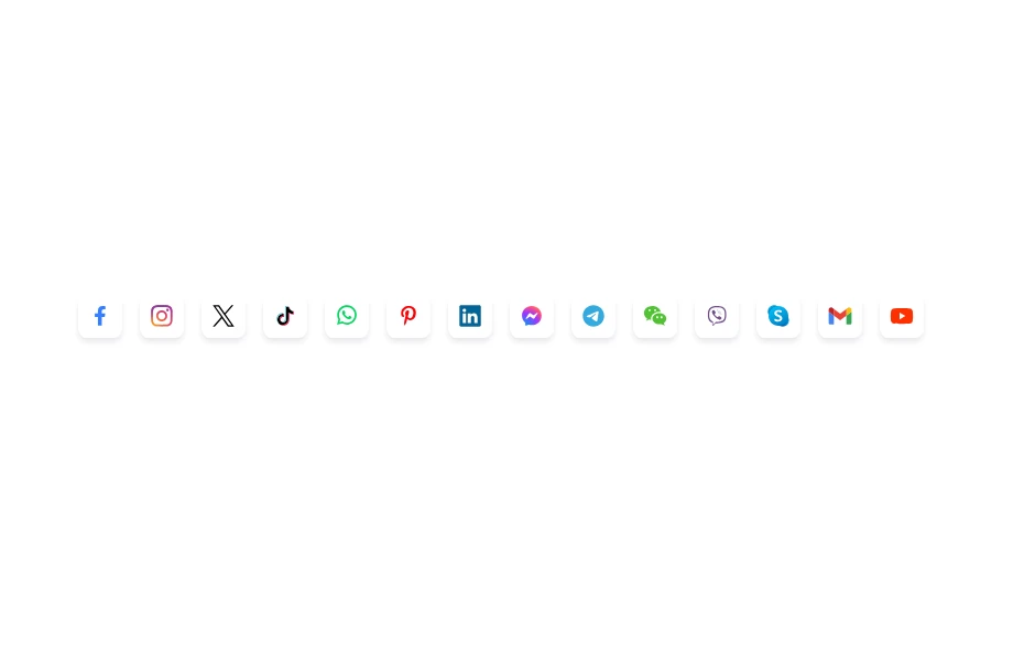
 Social Media Icons
Social Media Icons
1 year ago2.6k -
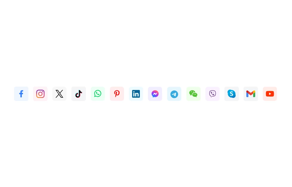
 Social Media Icons
Social Media Icons
1 year ago2.1k -
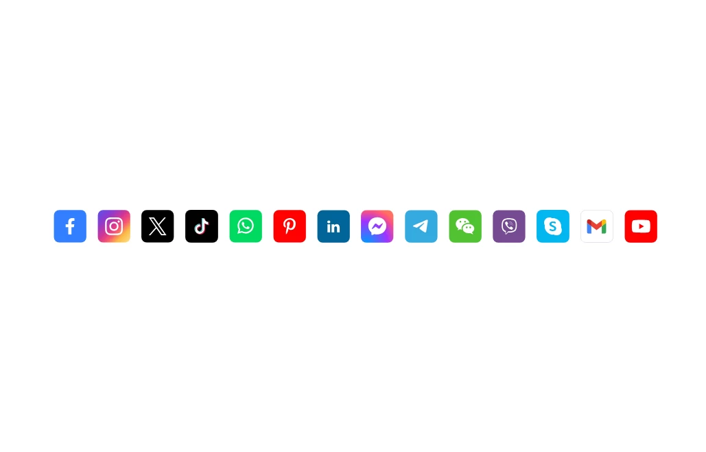
 Social Media Icons
Social Media Icons
1 year ago2.1k -
 Social Media Icons
Social Media Icons
1 year ago2.4k -
 3 years ago41.7k
 -
 Game changer
by salvator
8 months ago838 -
 icon
iconicon
1 year ago2.5k -
1 year ago2.6k
-
 Modern Dark Footer with Overlapping Gradient CTA
A comprehensive, dark-themed website footer component built with HTML and Tailwind CSS. It features a visually distinct overlapping section with a colorful gradient background containing a prominent call-to-action (CTA) block. The main footer area utilizes a multi-column grid layout for organized navigation links, a newsletter signup form, and social media icons. A final bottom bar includes legal links and copyright information. The design is responsive and adapts its layout for different screen sizes.
9 months ago1.1k -
Continue with Discord button
Login with the Discord button for social login
1 year ago3k -
 Home page 2
Отзывчивый логотип по центру. Интерактивные кнопки призыва к действию.
11 months ago846 -
 3 years ago12.6k


Explore components by Tags
Didn't find component you were looking for?
Search from 3000+ components