182+ Free Login Form examples in Tailwind CSS
A beautiful Login/Registration form is important for creating a positive user experience, as it is often the first point of contact between a user and a website or application. A well-designed login form can make users feel more comfortable and confident when entering their credentials, which can improve their overall impression of the site or app. Additionally, a visually appealing login form can help to establish the brand identity and reinforce the design language of the website or application.
Here is a collection of Login/Registration form components that are ready to use.
Similar terms: Register, Sign in
-
 1 year ago2.1k
 -
-
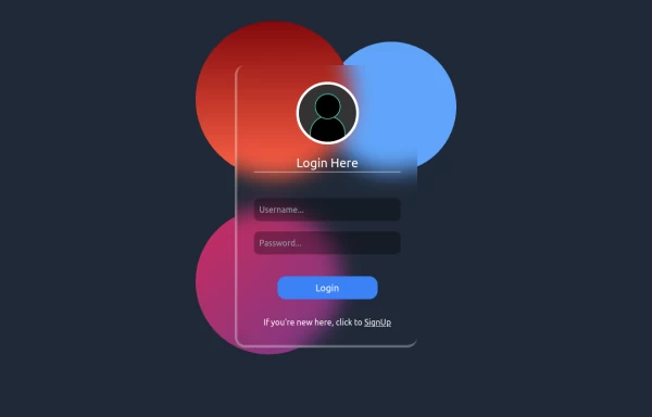
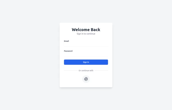
 Login
LoginLogin Creen office
1 year ago1.2k -
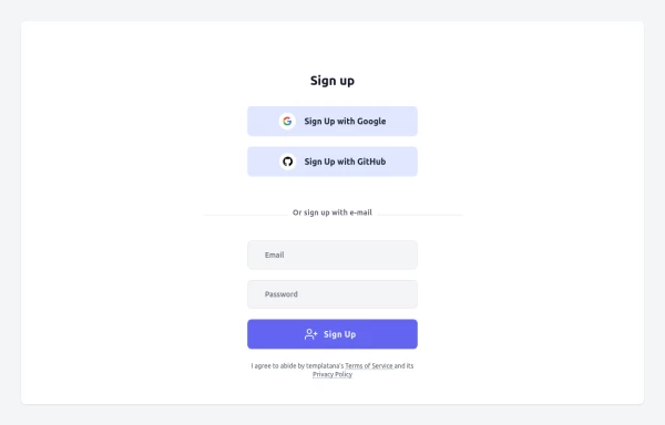
 Beautiful page login
form with continue with google and continue with github buttons
1 year ago1.6k -
 1 year ago1.4k
 -
 1 year ago1.4k
 -
 Login Form
Login Form With google icon
1 year ago1.8k -
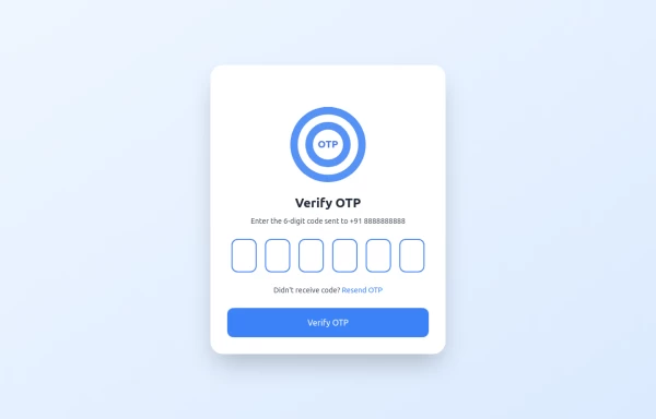 OTP Verification Page
A responsive and interactive OTP verification page built with Tailwind CSS. The page features a gradient background, hover effects, and animations to enhance user experience. It includes input fields for the OTP, a resend OTP link, and a verify button. The design is optimized for both light and dark modes.
11 months ago2.1k -
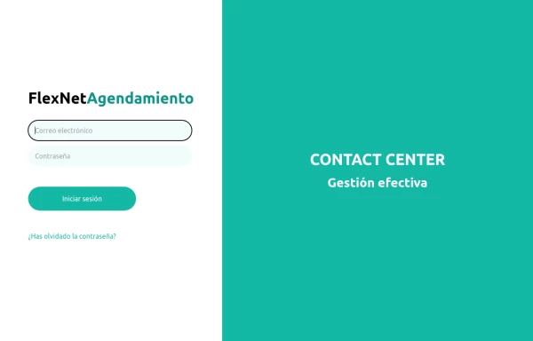
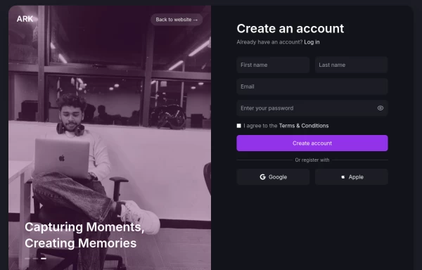 Login page
Login and register page, you can reuse both
11 months ago1.8k -
 11 months ago1.1k
 -
 11 months ago1.5k
 -
 Simple Login Form
Login Form Responsive Component
11 months ago1.3k -
 Simple Login & Register Page
Login and Register Page using Tailwind, Alpine JS, and Fontawesome
11 months ago2.9k -
 Registration Form
Color Updates: - Changed gradient background to `from-indigo-800 to-blue-900` - Updated text colors to `text-indigo-800` and `text-indigo-900` - Changed button colors to match the new theme - Updated focus rings to use indigo colors Enhanced Styling: - Added smooth transitions with `transition-all duration-300` - Improved shadow with `shadow-2xl` - Added hover scale effect on button - Increased border radius to `rounded-xl` - Added fade-in animation for the form Improved Validation: - Added visual feedback for invalid fields - Added input event listeners to clear error states - Added trim() to username and email validation - Added form reset after successful submission Accessibility Improvements: - Maintained proper contrast ratios - Kept focus states visible - Added proper spacing for better readability - Ensured all interactive elements are properly styled Added Interactions: - Smooth hover transitions - Scale animation on button hover - Immediate feedback on input - Clear error messaging
1 year ago2.7k -
 Login Form
Color Updates: - Changed background to gradient `from-indigo-800 to-blue-900` - Updated text colors to match the new theme - Updated button and interactive element colors - Added dark mode color variants Enhanced Styling: - Added gradient background - Increased padding and spacing - Improved border radius to `rounded-xl` - Added hover scale effects - Enhanced shadow with `shadow-2xl` Added Animations: - Fade-in animation on load - Scale transition on card hover - Button ripple effect on click - Smooth transitions for all interactive elements Improved Dark Mode: - Enhanced dark mode colors - Added system preference detection - Improved dark mode contrast - Added dark mode specific focus rings Enhanced Functionality: - Added basic form validation - Added ripple effect on button click - Improved hover and focus states - Added transition animations Accessibility Improvements: - Maintained proper contrast ratios - Enhanced focus states - Added proper ARIA attributes - Improved form labels
1 year ago2k


Didn't find component you were looking for?
Search from 3000+ components