55+ Free Gradient examples in Tailwind CSS
A gradient is a visual effect in which one color gradually blends into another. This is often used to create a smooth, seamless transition between two or more colors, and can be used to add depth and visual interest to a design.
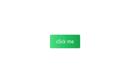
Gradients can be applied to backgrounds, images, text, and other elements in a user interface, and can be created using a variety of techniques, such as blending and shading. In web design, gradients are often created using CSS, which allows designers to specify the colors and direction of the gradient.
Some common types of gradients include linear gradients, which transition between colors in a straight line, and radial gradients, which transition in a circular or elliptical pattern.
-
 3 years ago9.5k
 -
-
 2 years ago13.6k
 -
Animated Gradient Background
animates a gradient background with vibrant colors. Slowly changes colors.
1 year ago26.9k -
 2 years ago8k
 -
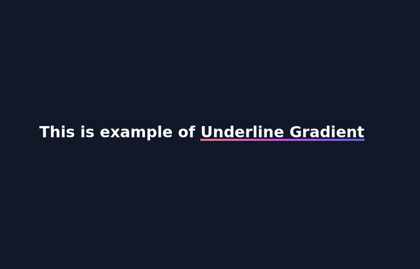 Underline Gradient
underlined gradient using background color
1 year ago2.9k -
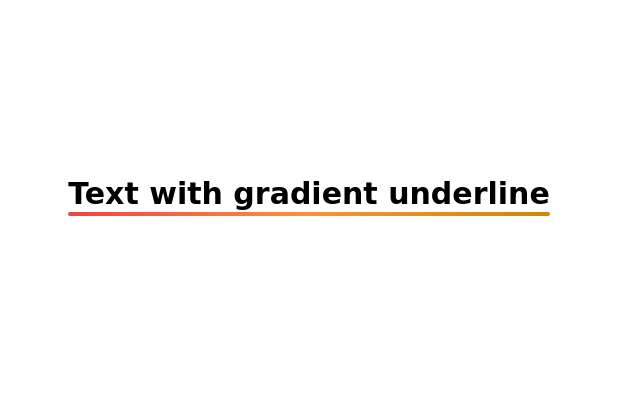 Text with gradient underline
Gradient Underline Text. Decorate your text with a gradient underline for a modern touch.
2 years ago10.8k -
 2 years ago3.7k
 -
 1 year ago1k
 -
 Hover effect card with background image
Beautiful card with background image, hover effect and gradient
1 year ago3.6k -
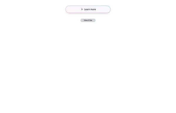 Bubblegum Button
This interactive button component is designed with a sleek gradient background and smooth hover effects, making it an eye-catching call-to-action element for modern web interfaces. Styling and Features: ✅ Gradient Background & Rounded Shape • The button container has a subtle gradient overlay (bg-gradient-to-tr) that smoothly transitions from soft pink (from-pink-300) to light blue (to-blue-300), giving it a vibrant and modern look. • Wrapped in a rounded-full container for a pill-shaped aesthetic. ✅ Floating & Shadow Effects • The shadow-lg property creates a soft floating effect, enhancing depth and visibility. • Will-change-transform optimizes animations for a seamless hover experience. ✅ Interactive Hover Animations • On hover, the inner button scales up (hover:scale-105) and lifts slightly (hover:-translate-y-2), simulating a press-and-release motion. • The transition is smooth, with a 500ms animation (transition duration-500). ✅ Content & Icon • The “Learn more” label is paired with a right-arrow icon (svg) for clear visual guidance. • The icon and text are flex-aligned (items-center flex), ensuring a balanced and responsive layout. This button is ideal for call-to-action elements, product highlights, or download prompts, offering a modern, sleek, and engaging user experience. 🚀
1 year ago1.4k -
 Gradient Flip-Text Button with Hover Animation
This stylish button features a dynamic gradient background that shifts from a calm green gradient by default to a vibrant purple-pink-red gradient on hover. The button also includes an interactive text flip effect, where the text seamlessly transitions on hover, creating a visually appealing and modern UI element. Perfect for adding flair to your websites or applications while maintaining functionality and responsiveness.
1 year ago1.3k -
 Modern Responsive Footer with Tailwind CSS
This sleek and modern responsive footer is built using HTML and Tailwind CSS. It features three sections: brand information, useful links, and social media icons. The footer includes smooth hover effects, subtle fade-in animations, and a fully responsive design that adapts seamlessly to different screen sizes. Perfect for websites looking for a professional and stylish footer section.
1 year ago2k -
 color blur
blur
1 year ago1.8k


Didn't find component you were looking for?
Search from 3000+ components