All components
-
 Search input asasasas
sasasasasas
1.8k -
 Animated Sign in background
Sign-in page with floating blobs as background.
4.2k -
Animated button with rotating light beam
light beam rotates around the border
4.1k -
 composent section presentation société
2.1k -
 Simple coming soon page
with background-image
3k -
 Designing a Responsive Form Layouts with Tailwind CSS
Enhance your web application by building a sleek and responsive Form Layouts using Tailwind CSS. This comprehensive guide walks you through creating an interactive Form Layouts section featuring.
3.6k -
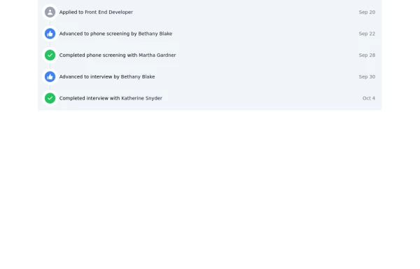 Designing a Responsive Activity Feed with Tailwind CSS
Enhance your web application by building a sleek and responsive activity feed using Tailwind CSS. This comprehensive guide walks you through creating an interactive feed section featuring customizable icons, links, and timestamps. Learn how to implement a visually appealing and accessible timeline that adapts seamlessly to any device, improving user engagement and overall experience
3.2k -
 3.1k
-
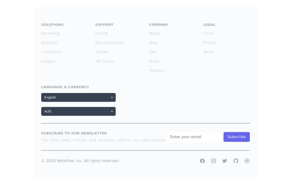 Crafting a Responsive Footer with TypeScript, and Tailwind CSS
This is a well-structured and comprehensive footer section that uses Tailwind CSS for styling and layout. Here’s a brief explanation of what each part does: Footer Container (<footer class="bg-gray-800">): The footer is wrapped in a <footer> element with a dark background using the bg-gray-800 class. The aria-labelledby="footer-heading" attribute is used for accessibility, linking the <footer> to the invisible heading (<h2 id="footer-heading" class="sr-only">Footer</h2>). Main Content Area: The content inside the footer is centered and spaced using utility classes like max-w-7xl mx-auto py-12 px-4 sm:px-6 lg:py-16 lg:px-8. Footer Sections: The footer is divided into several sections using grid layouts (xl:grid xl:grid-cols-5 xl:gap-8), which organize content into columns. Each section (Solutions, Support, Company, Legal) contains a heading with a list of links. These links are styled with Tailwind classes for consistent spacing and hover effects (text-base text-gray-300 hover:text-white). Language & Currency Selector: This section provides dropdowns for selecting language and currency. Tailwind's form utilities (@tailwindcss/forms plugin) are used to style the select elements. Newsletter Subscription Form: A subscription form is provided with an email input and a submit button. The form is styled to be responsive, with focus states for accessibility (focus:ring-2 focus:ring-offset-2). Social Media Links: Social media icons (Facebook, Instagram, etc.) are included, each wrapped in a link with hover effects. Icons are created using SVGs, which are scalable and look sharp at any size. Final Section: The footer concludes with another grid layout, ensuring spacing and alignment for different screen sizes. Customization Tips: Colors: You can easily customize the colors using Tailwind's utility classes (e.g., bg-gray-800, text-gray-400) to match your design. Icons: Replace SVGs with the appropriate icons for your needs. You might use a different icon set or add more icons. Responsive Design: Tailwind's utility classes like sm:, md:, lg:, xl: ensure that the footer is responsive across devices. Adjust the layout or padding if needed. Additional Considerations: SEO: Ensure the links in the footer point to meaningful pages to improve SEO. Accessibility: Consider adding aria-labels to the form elements and social media links to enhance accessibility further. This footer is ready to be integrated into a Tailwind CSS-powered project, offering both aesthetic appeal and functional utility.
3.8k -

-
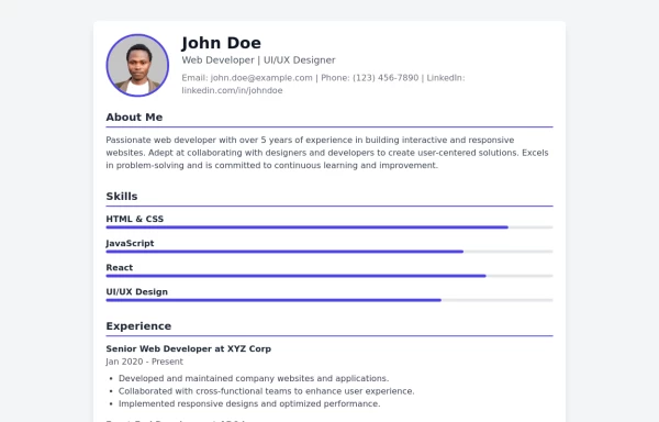 Modern CV Template - Stylish HTML and Tailwind CSS Design for Professionals
Download this modern CV template crafted with HTML and Tailwind CSS. Featuring a clean, stylish design and easy customization, this CV template is perfect for professionals looking to make a strong impression. Showcase your skills, experience, and education with a visually appealing and responsive layout.
3.7k -
 Showcase Your Services with Interactive Animations: A Modern HTML and Tailwind CSS Example
Discover how to create an eye-catching services section using plain HTML and Tailwind CSS. This modern example features interactive animations that bring your services to life. With smooth hover effects and responsive design, this section is perfect for enhancing your website's user experience. Easily customize the content to fit your needs, and let Tailwind CSS handle the styling and transitions for a polished, professional look.
3.5k -

-
 Modern Sign Up Page
Dive into a world of cool animations and captivating visuals. This beautifully crafted interface is not only eye-catching but also highly functional. You can use it as-is or customize it to make it your own. Share your ideas, and let’s create something extraordinary together!” Feel free to tweak it further or add any specific details you’d like. 😊🎨
3k -
 Minimalist Hero Section
A minimal but nice hero section.
2.5k