Animated Sign in background
Sign-in page with floating blobs as background.
This tailwind example is contributed by Nii Anyetei, on 30-Aug-2024. Component is made with Tailwind CSS v3. It is responsive. similar terms for this example are Register, Sign in

Author Nii Anyetei
Related Examples
-
 3 years ago19.8k
 -
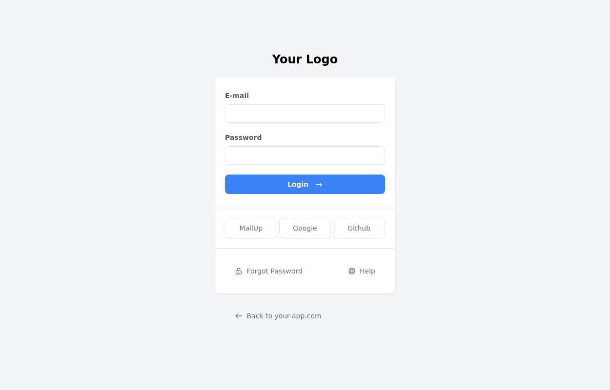
 login
loginlogin
4 months ago633 -
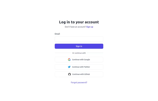
 Beautiful page login
form with continue with google and continue with github buttons
1 year ago1.6k -
 3 years ago11.5k
 -
 Login form
Component was one shot generated using https://inspi.me
2 weeks ago104 -
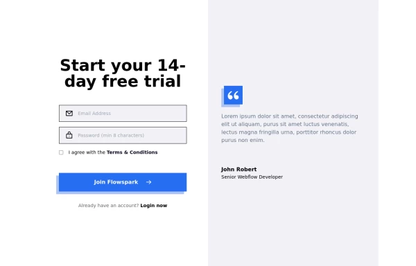
 Modern Sign Up Page
Dive into a world of cool animations and captivating visuals. This beautifully crafted interface is not only eye-catching but also highly functional. You can use it as-is or customize it to make it your own. Share your ideas, and let’s create something extraordinary together!” Feel free to tweak it further or add any specific details you’d like. 😊🎨
1 year ago2.5k -
 Authentication
Tailwind CSS Authentication Beautifully designed, fully responsive, expertly crafted authentication examples
9 months ago1.1k -
 3 years ago13.4k
 -
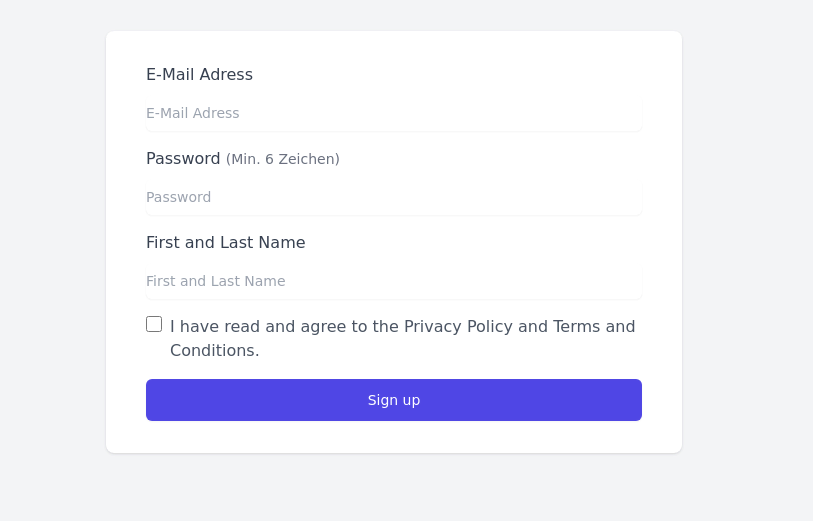
 Simple Sign up form
A responsive simple singup or login form
1 year ago2.4k -
 1 year ago2.4k
 -
 Complete Profile Form with Avatar Upload & Social Links
A fully responsive profile setup form built with Tailwind CSS and Alpine.js. Users can upload a profile picture, fill in personal and professional details, add social links, and receive real-time validation feedback. Includes a smooth success message animation after submission, with optional navigation to the profile or dashboard. Perfect for onboarding flows or user account management interfaces.
3 months ago200 -
 6 months ago532


Explore components by Tags
Didn't find component you were looking for?
Search from 3000+ components