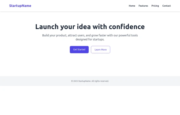
Minimalist Hero Section
A minimal but nice hero section.
This tailwind example is contributed by VoltagedDev, on 26-Aug-2024. Component is made with Tailwind v3.4. It is responsive.

Related Examples
-
 2.2k
-
 tiket token
enter in stadium using tecinology
1.8k -
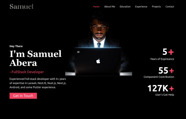 Portfolio Hero Section 3
visually stunning and captivating hero section component for your portfolio website.
9.8k -
 Clean AI Chat UI with Tailwind CSS – ChatGPT-Style Interface
A polished and responsive AI chat interface built using modern Web Components and Tailwind CSS. This UI replicates the smooth, minimal experience of ChatGPT with a clean layout, floating input bar, animated scrollable message feed, and mock AI responses. Ideal for SaaS dashboards, AI assistants, or frontend prototypes. Designed with professional spacing, accessible colors, and reusable components. Key features: Responsive layout with mobile support Floating input bar with auto-expanding textarea Tailwind-powered message bubbles with clear sender roles Modern dark theme with subtle gradients and shadows Easily extendable to real AI APIs (e.g., OpenAI)
-

-
 Perspective 3D
779 -
 Responsive Hero Section
Key features of this hero section: 1. Responsive layout: Uses a column layout on mobile and switches to a row layout on medium screens and larger. 2. Left side: - Company name as a large heading - Brief description - "Learn More" button 3. Right side: - "Why Choose Us?" section with bullet points - Two call-to-action buttons: "Get Started" and "Contact Sales" 4. Styling: - Uses Tailwind's utility classes for responsive design, colors, spacing, and typography - Incorporates a shadow and rounded corners for the right-side content box - Includes hover effects on buttons for better interactivity This hero section will be fully responsive: - On mobile devices, it will stack vertically with the company info on top and the details below. - On larger screens, it will display in a two-column layout. The use of Tailwind CSS classes ensures that the design is consistent and easily adjustable. You can further customize the colors, fonts, and spacing to match your brand's specific design guidelines. Would you like me to explain any part of this code or make any adjustments?
2.6k -
 Interactive 3D Morphing Globe - Sphere to Star
3D interactive particle globe that morphs between a sphere and a star shape. Features custom glassmorphism UI, click-to-pulse bloom effects, and dynamic color themes. Built by Mostafa Niloy (Visernic Limited) using Three.js and Tailwind CSS.
524 -
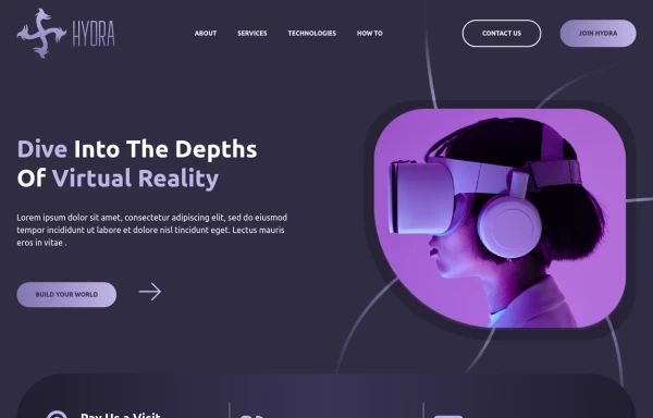 Responsive Header and Hero Section Design
 provides flexible adaptability across all screen sizes and devices.
3.7k -

-
 work hard
by salvator
940 -
 beautifull portfolio page
I create a portfolio page
3.2k









Browse by topic
Explore components by Tags
Jump straight to the UI pattern you need.
Can't find it?
Didn't find the component you were looking for?
Search across 3,000+ community-built components and grab the code in seconds.