composent section presentation société
composent section presentation société
This tailwind example is contributed by Omer fils ELENGA, on 29-Aug-2024. Component is made with Tailwind CSS v3. It is responsive.

Author Omer fils ELENGA
Related Examples
-
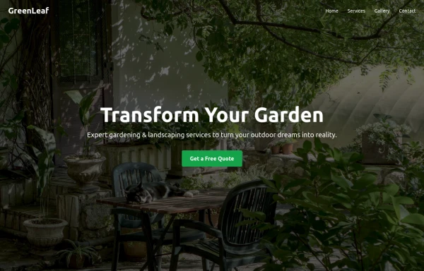 GreenLeaf
Transform Your Garden
9 months ago1.2k -
 card section neon
card section neon
3 weeks ago167 -
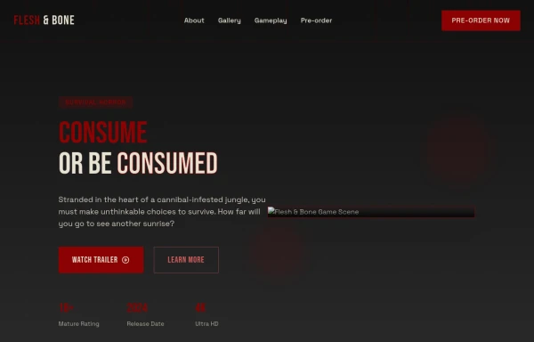 Game changer
by salvator
9 months ago974 -
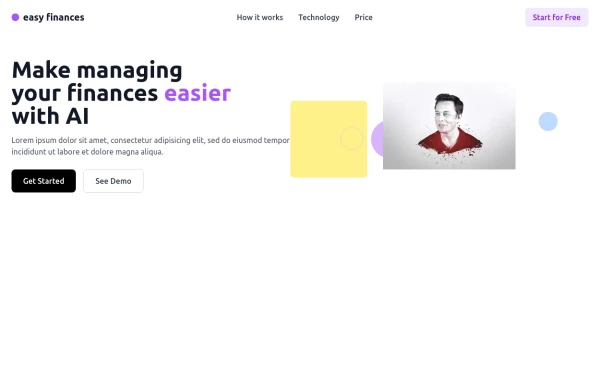 Managing Finance Hero
Create a modern and responsive Hero Section using TailwindCSS. This section features a bold headline, a subheading, and a call-to-action button, designed to grab user attention instantly. With a clean layout, engaging typography, and a visually appealing background, this hero section enhances the first impression of your website. Ideal for landing pages, e-commerce, and SaaS platforms, it ensures a seamless experience across all devices.
1 year ago1.3k -
 1 year ago2.1k
 -
-
 Innovative Rwanda-Canada Transport Services Website
Innovative Rwanda-Canada Transport Services Website
6 months ago481 -
 Magic Sound
by salvator
9 months ago1.1k -
 7 months ago876
 -
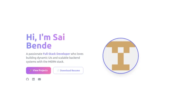
 Responsive Hero Section
Key features of this hero section: 1. Responsive layout: Uses a column layout on mobile and switches to a row layout on medium screens and larger. 2. Left side: - Company name as a large heading - Brief description - "Learn More" button 3. Right side: - "Why Choose Us?" section with bullet points - Two call-to-action buttons: "Get Started" and "Contact Sales" 4. Styling: - Uses Tailwind's utility classes for responsive design, colors, spacing, and typography - Incorporates a shadow and rounded corners for the right-side content box - Includes hover effects on buttons for better interactivity This hero section will be fully responsive: - On mobile devices, it will stack vertically with the company info on top and the details below. - On larger screens, it will display in a two-column layout. The use of Tailwind CSS classes ensures that the design is consistent and easily adjustable. You can further customize the colors, fonts, and spacing to match your brand's specific design guidelines. Would you like me to explain any part of this code or make any adjustments?
1 year ago2.8k -
 home page
Hero Section: Gradient background with noise texture Animated floating image Gradient text effect Call-to-action buttons Features Section: Three feature cards with gradient headers Hover animations Clean iconography Stats Display: Full-width gradient background Clean stat presentation Testimonials: Three testimonial cards with user avatars Star ratings Border accents Hover scaling effects Call-to-Action (CTA) Section: Gradient background Centered content Multiple action buttons Footer: Four-column layout Social media icons Newsletter signup Copyright information Design Features: Vibrant gradient color scheme Smooth hover animations and transitions Responsive layout for all screen sizes Modern typography Subtle floating animations Clean, card-based design
9 months ago1.1k -
 tinderclone By omerlinks
tinderclone By omerlinks
1 month ago68


Explore components by Tags
Didn't find component you were looking for?
Search from 3000+ components