Hero (with dark mode)
Full-width hero section with background image overlay. Includes headline, description text and CTA buttons. Supports dark mode and responsive design.
This tailwind example is contributed by Maxim, on 02-Jan-2025. Component is made with Tailwind CSS v3. It is responsive. It supports dark mode.

Author Maxim
Related Examples
-
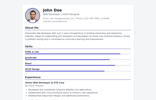 Modern CV Template - Stylish HTML and Tailwind CSS Design for Professionals
Download this modern CV template crafted with HTML and Tailwind CSS. Featuring a clean, stylish design and easy customization, this CV template is perfect for professionals looking to make a strong impression. Showcase your skills, experience, and education with a visually appealing and responsive layout.
1 year ago3.2k -
 FUTURIC.
FUTURIC.
2 days ago13 -
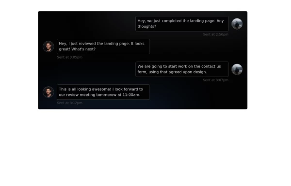 Chat Box for Marketing
An Onyx component. This chat box is great for SAAS landing pages where you want to mock customer interactions or expectations.
1 year ago2k -
 Tool Box
by salvator
9 months ago1.3k -
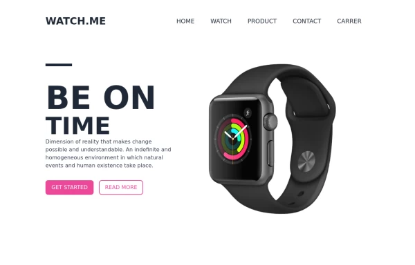 Product Page
Showcase for the product.
1 year ago2.6k -
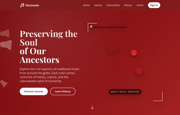 tradition music
by salvator
9 months ago866 -
 1 year ago2.5k
 -
 8 months ago1.1k
 -
 Portfolio Hero Section 3
visually stunning and captivating hero section component for your portfolio website.
1 year ago8.8k -
 Responsive Portfolio Webpage with Tailwind CSS
This is a reusable and responsive portfolio webpage template created with HTML and Tailwind CSS. Designed for developers or creatives, the template includes essential sections like Header, Hero, About, Skills, Experience, Projects, Testimonials, Contact Form, and Footer. It features a clean, modern design and is fully customizable without requiring JavaScript. Perfect for showcasing personal or professional work on the web.
1 year ago2.4k -
 Hero Section
Created a good and responsive web Hero Page
1 year ago2.7k -
 login
loginSign in page on computer screen. Desktop computer with login form and sign in button. User account. Modern concept for web
9 months ago1.1k


Explore components by Tags
Didn't find component you were looking for?
Search from 3000+ components