Buttons with shadow
This tailwind example is contributed by Leon Bachmann, on 19-Jan-2023. Component is made with Tailwind CSS v3. It is responsive. It supports dark mode.

Author Leon Bachmann
Related Examples
-
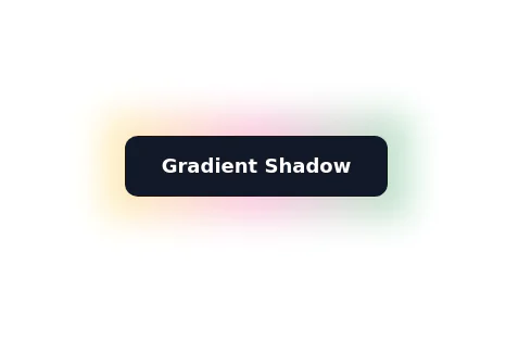
Glowing gradient button
Button on black background
3 years ago39.5k -
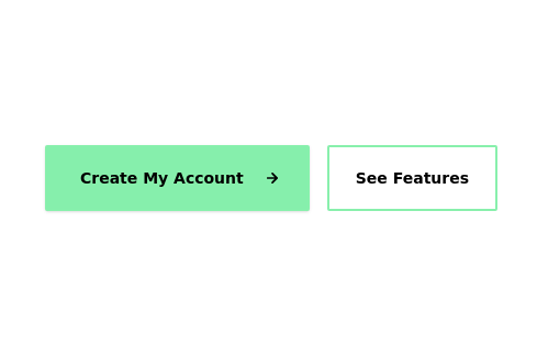
 Primary and secondary button pair
Call to action buttons
3 years ago16.9k -
 3 years ago18.4k
 -
 3 years ago17.6k
 -
 Call to action buttons
Pair of active primary and secondary buttons. Elevated buttons w/ border bottom
2 years ago9.8k -
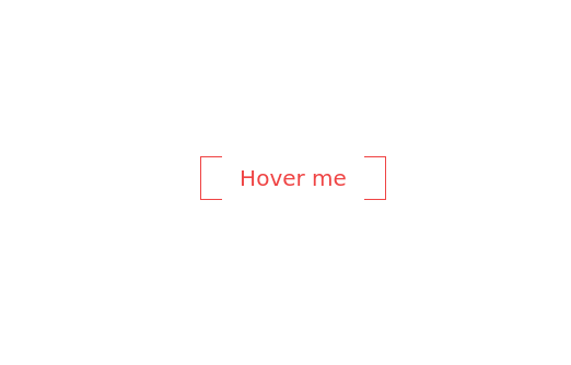
 Buttons popup on hover
Popup buttons on hover
3 years ago14.5k -
 3 years ago11k
 -
 3 years ago10.1k
 -
 3 years ago12.6k
 -
 Botton hover
On hover Changes text
2 years ago7.1k -
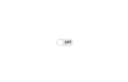 Interactive Toggle Switch with Smooth Animation
A stylish toggle switch component built with Tailwind CSS and enhanced with minimal JavaScript. This toggle switch features smooth color transitions, dynamic text ("ON/OFF"), and a moving indicator ball, providing a visually appealing and functional design. Ideal for modern web interfaces where toggling functionality is required. Easily customizable for various use cases.
1 year ago1.8k -
1 year ago2.1k


Explore components by Tags
Didn't find component you were looking for?
Search from 3000+ components