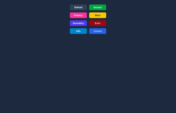
Buttons!
This tailwind example is contributed by Crimson, on 14-Jan-2025. Component is made with Tailwind CSS v3. It is responsive.

Author Crimson
Related Examples
-
 1 year ago2.9k
 -
Color changing button
changes the color of a button automatically and continuously
2 years ago8.5k -
 Elegant Buttons
Useful Tailwind classes for creating several types of basic buttons.
10 months ago954 -
 1 year ago2.5k
 -
 Store buttons (apple,google play)
apple, google play store buttons
3 years ago15k -
Animated button with rotating light beam
light beam rotates around the border
1 year ago3.3k -
 2 years ago7.3k
 -
 3 years ago14.6k
 -
 1 year ago3.2k
 -
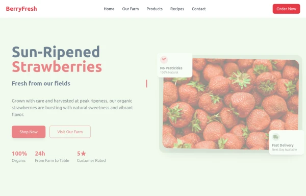 strawbery
by salvator
9 months ago906 -
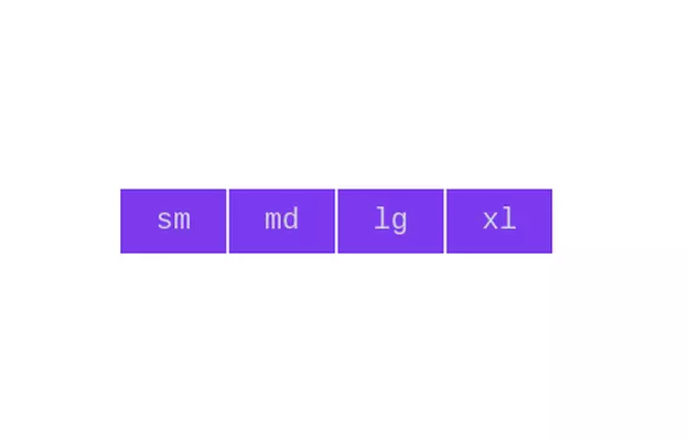 Button group
Add active class to clicked button using JavaScript
3 years ago10.8k -
 3 years ago12.7k


Explore components by Tags
Didn't find component you were looking for?
Search from 3000+ components