CTA gradient button
This tailwind example is contributed by Anonymous, on 07-Jul-2024. Component is made with Tailwind CSS v3. It is responsive. It supports dark mode.

Author Anonymous
Related Examples
-
 Neo-Brutalism UI Button Collection - Bold CSS Button Styles withTailwind CSS
Bold, chunky neo-brutalism buttons with thick borders and strong shadows for modern web design. Explore our collection of vibrant, high-contrast CSS buttons with hover effects and dark mode support.
3 months ago599 -
 3 years ago11.1k
 -
 Hamburger menu button with open/close animation
Open and close animation onclick requires alpineJs
3 years ago20.1k -
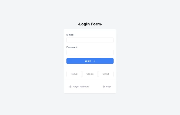 Login Form
Login Form
1 year ago2.3k -
 3 years ago19.6k
 -
 Tilted button on hover.
A simple button with a gradient and tilt on hover. Dark mode supported with same color.
1 year ago1.2k -
 Game changer
by salvator
9 months ago1.1k -
 Input Formulario
Input used in the form Link form: https://tailwindflex.com/@ameth1208/login
1 year ago3k -
 2 months ago421
 -
 3 years ago12.7k
 -
1 year ago2.8k
-
 3 years ago10.1k


Explore components by Tags
Didn't find component you were looking for?
Search from 3000+ components