Get it on Google Play button dark
This tailwind example is contributed by Simon Scheffer, on 14-Jan-2023. Component is made with Tailwind CSS v3. It is responsive.

Author Simon Scheffer
Related Examples
-
 Playstore Button
Download on the play store button
3 years ago14.9k -
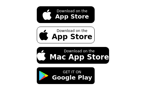 Store buttons (apple,google play)
apple, google play store buttons
3 years ago15.1k -
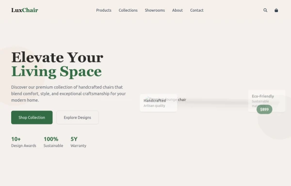 chair
chairby salvator
9 months ago1.1k -
 3 years ago12.1k
 -
 1 year ago3.4k
 -
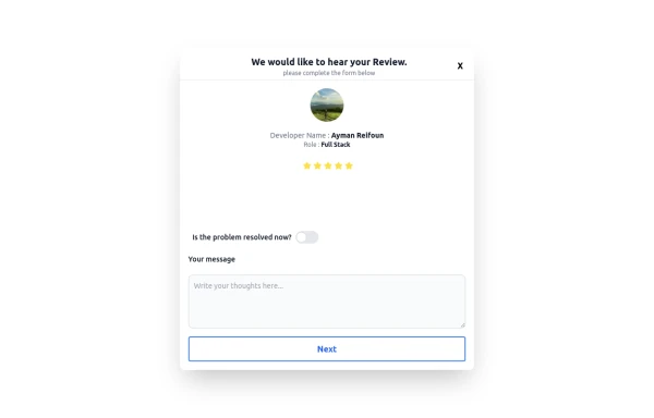 Review popup form with toggle and stars
Review popup form with toggle and stars
10 months ago964 -
 3 years ago10k
 -
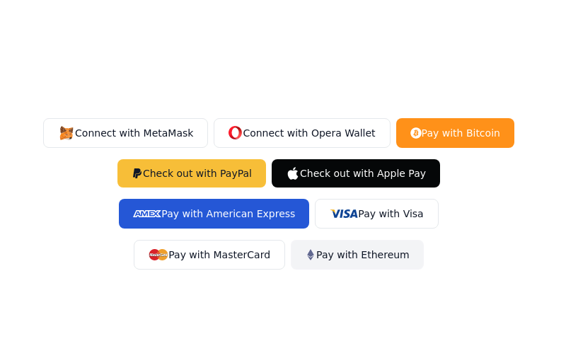
 Neo-Brutalism UI Button Collection - Bold CSS Button Styles withTailwind CSS
Bold, chunky neo-brutalism buttons with thick borders and strong shadows for modern web design. Explore our collection of vibrant, high-contrast CSS buttons with hover effects and dark mode support.
3 months ago681 -
 1 year ago2.7k
 -
 1 year ago1.7k
 -
1 year ago2.8k
-
 1 year ago1.9k


Explore components by Tags
Didn't find component you were looking for?
Search from 3000+ components