Store buttons (apple,google play)
apple, google play store buttons
This tailwind example is contributed by Simon Scheffer, on 12-Dec-2022. Component is made with Tailwind CSS v3.

Author Simon Scheffer
Related Examples
-
 Playstore Button
Download on the play store button
3 years ago14.9k -
 2 years ago8.7k
 -
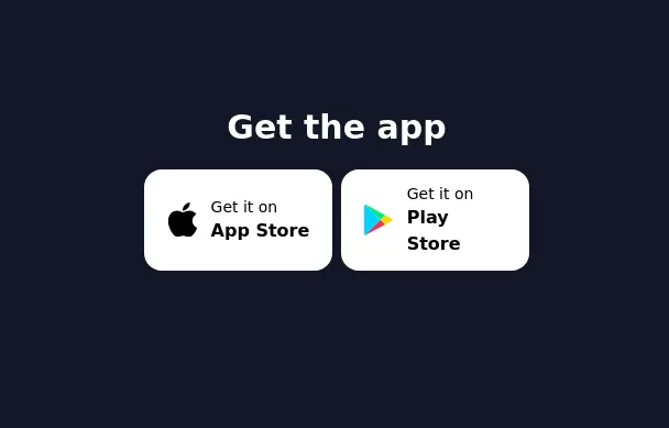 Get the app section
Play store and App store buttons
3 years ago9.7k -
 3 years ago10.3k
 -
 3 years ago12.7k
 -
 3 years ago13.2k
 -
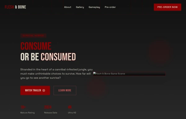 Game changer
by salvator
9 months ago979 -
 3 years ago12.1k
 -
 7 months ago575
 -
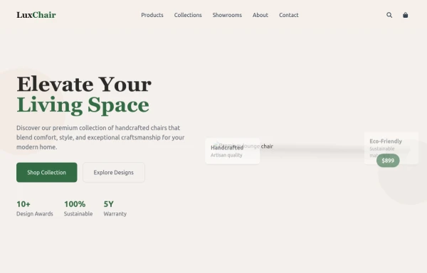 chair
chairby salvator
9 months ago1.1k -
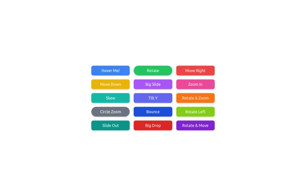 button animation
button animation big
9 months ago995 -
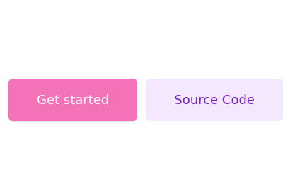
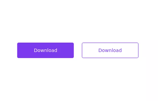 Primary and secondary button pair
Call to action buttons
3 years ago16.9k


Explore components by Tags
Didn't find component you were looking for?
Search from 3000+ components