Navbar
Hover-Activated Dropdowns: The "Solutions" and "Company" menus open on hover with smooth scale and opacity transitions. Each dropdown organizes links into sections with icons, descriptions, and even a notification badge for the "Careers" link.
Rich Interaction Feedback: All navigation items and buttons respond with color changes, background shifts, and shadow effects on hover. The notification bell includes a live status dot, and the profile button uses a gradient background.
Responsive Foundation: The layout includes a hidden mobile menu with a toggle button, ensuring the navigation adapts to different screen sizes while maintaining the professional aesthetic.
This tailwind example is contributed by Muzammil Riaz, on 13-Jul-2026. Component is made with Tailwind v3.4. It is responsive.

Related Examples
-
 Navbar Section
Responsive Navbar
24.4k -
 omerlinkStream
omerlinkStream
1.2k -
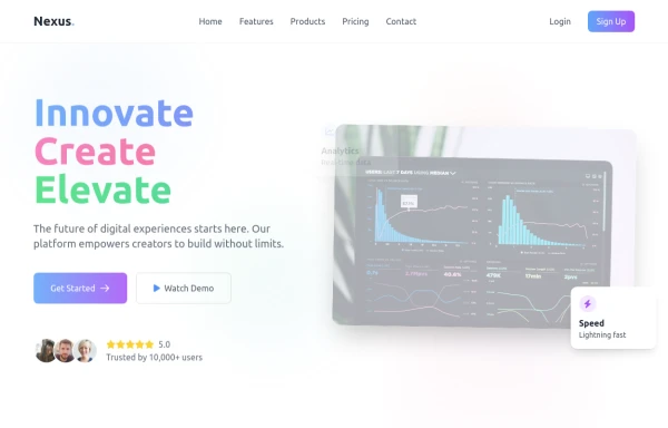 Modern page
hero page by salvator
1.9k -
 Premium High-Performance Web Gaming Hub
Experience the future of browser-based gaming. I’ve developed a premium arcade hub designed for speed, clarity, and zero-latency gameplay. Built with modern web technologies, Ayyamperumal Games brings AAA-inspired visuals and high-octane mechanics directly to your browser—no downloads, no lag, just pure performance. Explore a curated library of titles ranging from minimalist logic puzzles like Sudoku Elite to fast-paced action in Neon Drift. This is where clean code meets high-level entertainment.
938 -

-

-
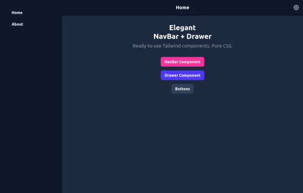 Elegant NavBar + Drawer
A NavBar, a responsive drawer/sidebar, and other useful Tailwind components to get started creating an app. Pure CSS, no JavaScript needed (although this example uses a bit of JS).
1.8k -
 Brand Navbar
Menu side bar navigation bar
1.2k -
 mobil navigation
mobil navigation
1.2k -
 SaaS Dashboard Navbar with Search, Notifications & Slide-In Mobile Menu
SaaS dashboard navbar built with pure HTML and Tailwind CSS.
222 -
-
 avigation Mobile iOS - SPA
avigation Mobile iOS - SPA
758








Browse by topic
Explore components by Tags
Jump straight to the UI pattern you need.
Can't find it?
Didn't find the component you were looking for?
Search across 3,000+ community-built components and grab the code in seconds.