- Home
-
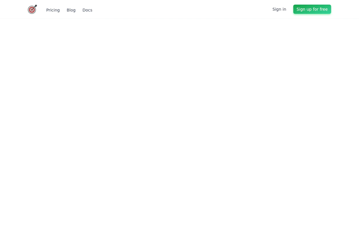
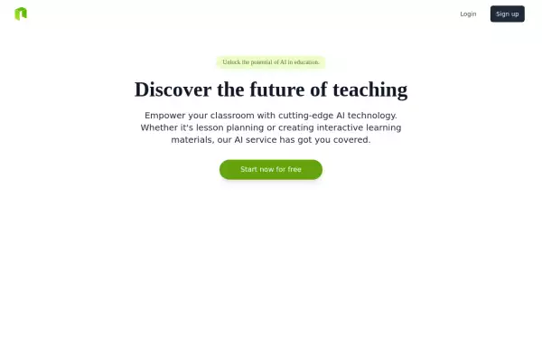
Navbar with Icon on the left, links and call to actions on the right
This tailwind example is contributed by Anonymous, on 09-Jul-2024. Component is made with Tailwind CSS v3. It is responsive.

Author Anonymous
Related Examples
-
less is more
less is more by salvator
5 days ago57 -
Responsive eCommerce Sidebar Layout with Hamburger Menu | Tailwind CSS UI for Online Stores
Build a clean and responsive eCommerce sidebar layout with a smooth hamburger menu using Tailwind CSS and Alpine.js. Ideal for devotional, spiritual, or modern online stores. Includes dark mode support, navigation links, cart, login, and a dynamic layout for beautiful product pages.
1 month ago242 -
Navbar
This navbar implementation includes: 1. Responsive design that works on both desktop and mobile 2. Indigo-800 and Blue-900 color scheme for the background and accents 3. Dark mode support with a toggle button 4. Beautiful animations and effects: 1. Fade-in animation for menu items with staggered delays 2. Hover effects on menu items with underline animation 3. Smooth color transitions 4. Mobile menu slide-down animation 5. SVG icons for the dark mode toggle and mobile menu button 6. "Sign Up" call-to-action button 7. Mobile-friendly dropdown menu 8. Accessibility considerations (proper heading structure, color contrast, focus styles) Key features: - The background uses a gradient from Indigo-800 to Blue-900 - The navbar has a white background in light mode and dark gray in dark mode - Text colors are adjusted for readability in both light and dark modes - Menu items have hover effects with color changes and underline animations - The dark mode toggle changes its icon based on the current mode - The mobile menu slides down with a smooth animation when toggled - Desktop menu items fade in with a staggered delay for a smooth entrance - Dark mode is automatically applied based on system preferences - The layout is responsive, with a hamburger menu for mobile screens This implementation provides a visually appealing and functional navbar with various animations and effects, using HTML, Tailwind CSS, and vanilla JavaScript for the interactions.
7 months ago3.4k -
5 months ago850
-
admin panel UI
Premium Admin Panel Pack including sidebar navigation, top navbar, dashboard cards, user tables, quick actions, profile section, and footer. Fully responsive with modern clean design using Tailwind CSS.
4 days ago65 -
3 months ago991
-
5 months ago1.5k
-
Responsive Gradient Navbar with Toggle
A modern, responsive navbar built with Tailwind CSS. Features a gradient background, flex layout, smooth hover effects, and a mobile toggle menu for optimal usability on all screen sizes.
2 weeks ago116 -
Elegant NavBar + Drawer
A NavBar, a responsive drawer/sidebar, and other useful Tailwind components to get started creating an app. Pure CSS, no JavaScript needed (although this example uses a bit of JS).
1 month ago265 -
1 year ago6.4k
-
Responsive Tailwind CSS Header with Navigation & Buttons | Ready to Use
A fully responsive and modern header built with Tailwind CSS. Features a sleek navigation menu, login/register buttons, and adaptive design for all screen sizes. Open-source and easy to integrate into any web project!
2 months ago660 -
Minimalistic navbar
Responsive navbar
2 years ago19.2k
Explore components by Tags
Didn't find component you were looking for?
Search from 2400+ components