Stylish Mobile-First Navigation Bar Using Tailwind
This project showcases a sleek, fixed-top responsive navigation bar crafted with Tailwind CSS. Featuring a vibrant gradient background, a bold uppercase logo, and smooth pink hover effects, it adapts beautifully across devices. On desktop, the navigation links appear horizontally with ample spacing, while on mobile, a hamburger menu toggles a stylish dropdown with rounded corners and subtle shadows. The navbar’s semi-transparent backdrop with blur adds a modern glassmorphism touch, making it perfect for contemporary web designs.
This tailwind example is contributed by Bonimater, on 22-May-2025. Component is made with Tailwind CSS v3. It is responsive. It supports dark mode. similar terms for this example are collapsible,about me

Author Bonimater
Related Examples
-
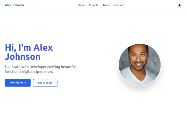
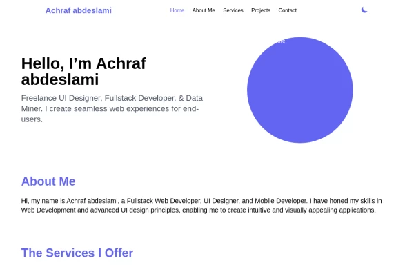 Responsive portfolio with dark mode
responsive and support dark mode .portfolio website
1 year ago3.9k -
 canvas fully covers
canvas fully covers
1 year ago4.5k -
 canvas fully covers
canvas fully covers
10 months ago1k -
 8 months ago771
 -
 Intelligent AI tools built to help.
Unlock smarter workflows with AI tools designed to boost productivity, simplify tasks and help you do more with less effort.
1 month ago76 -
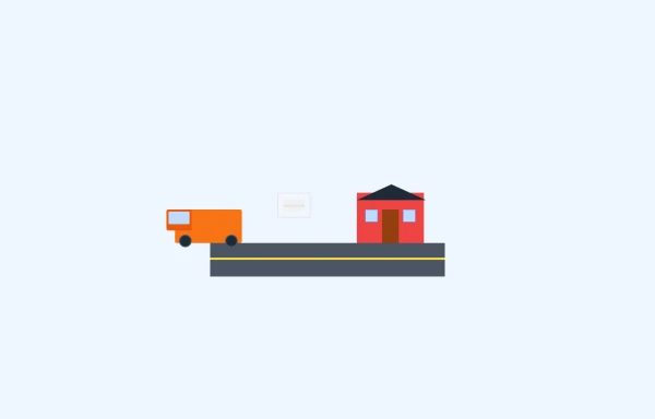 bugger delivary animation
this playground is responsive and animated bugger delivary
9 months ago729 -
 1 year ago2.5k
 -
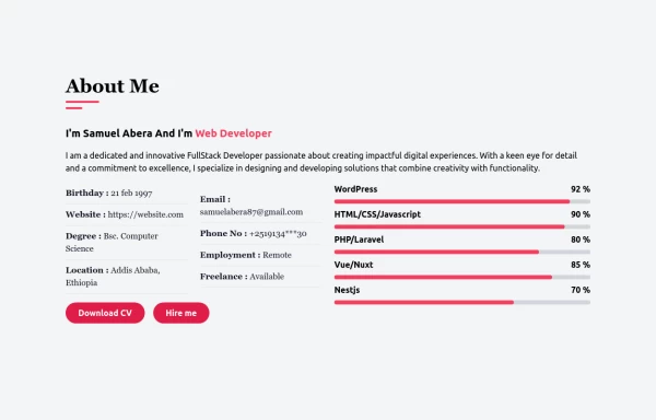
 Simple web portfolio
The portfolio includes all required sections (Hero, Projects, About, Contact) with professional styling, and I've added some premium touches like social media icons, a sticky navigation, and beautiful gradient effects that make it feel cutting-edge and engaging.
9 months ago1.2k -
 1 year ago1.3k
 -
 details & summary beautiful styling & animation
details & summary beautiful styling & animation
1 year ago2.3k -
 Clean AI Chat UI with Tailwind CSS – ChatGPT-Style Interface
A polished and responsive AI chat interface built using modern Web Components and Tailwind CSS. This UI replicates the smooth, minimal experience of ChatGPT with a clean layout, floating input bar, animated scrollable message feed, and mock AI responses. Ideal for SaaS dashboards, AI assistants, or frontend prototypes. Designed with professional spacing, accessible colors, and reusable components. Key features: Responsive layout with mobile support Floating input bar with auto-expanding textarea Tailwind-powered message bubbles with clear sender roles Modern dark theme with subtle gradients and shadows Easily extendable to real AI APIs (e.g., OpenAI)
10 months ago2k -
 3 years ago12k


Explore components by Tags
Didn't find component you were looking for?
Search from 3000+ components