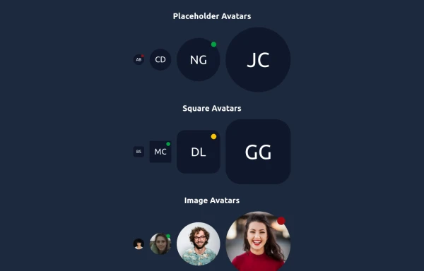
Avatar with activity indicator
online indicator pulse animation
This tailwind example is contributed by Prashant, on 29-Aug-2022. Component is made with Tailwind CSS v3.

Author Prashant
Related Examples
-
 3 years ago11.8k
 -
 3 years ago11.1k
 -
 Taskify Premium Task Management FREE
Website Task management modern and responsif
1 month ago179 -
 3 years ago9.6k
 -
 chat ui advanced
Professional chat ui, connect me for jsx https://abhirajk.vercel.app/
1 year ago1.8k -
 Elegant Avatars
Useful Tailwind classes for constructing avatars with status markers. Comes with an example edit/preview avatar for the user to choose an image with the file chooser.
10 months ago665 -
 2 years ago8k
 -
 3 years ago15k
 -
 3 years ago9.8k
 -
 Horizon Premium Dashboard Tailwind
Website Dashboard Admin with tailwind CSS CDN
1 month ago258 -
 3 years ago10k
 -
 Meet the Team Section with Team Member Cards
Meet the Team Section with Team Member Cards
1 year ago4.4k


Explore components by Tags
Didn't find component you were looking for?
Search from 3000+ components