Divine Shree Ram Hero Section | Tailwind CSS Responsive UI for Devotional |Hero section |Hero
Explore a stunning and responsive Hero Section dedicated to Lord Ram, crafted with Tailwind CSS. Perfect for spiritual brands, Ramayana-inspired products, or devotional e-commerce platforms. Fully responsive, dark mode compatible, and animation-rich UI.
This tailwind example is contributed by Rajesh Pandey, on 16-May-2025. Component is made with Tailwind CSS v3. It is responsive.

Author Rajesh Pandey
Related Examples
-
 DailyDev Card
Card -based card used in the Dailydev Card, this is created to be modified to taste of each user
1 year ago1.8k -
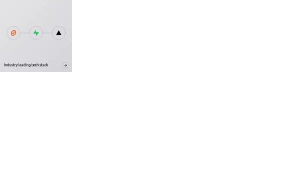 Animated bento box.
A Coastal UI component (coastalui.com). This can be used as part of a bento box, great for showing connectivity between context, could be used beyond just showing tech stacks.
11 months ago1.4k -
 Clean AI Chat UI with Tailwind CSS – ChatGPT-Style Interface
A polished and responsive AI chat interface built using modern Web Components and Tailwind CSS. This UI replicates the smooth, minimal experience of ChatGPT with a clean layout, floating input bar, animated scrollable message feed, and mock AI responses. Ideal for SaaS dashboards, AI assistants, or frontend prototypes. Designed with professional spacing, accessible colors, and reusable components. Key features: Responsive layout with mobile support Floating input bar with auto-expanding textarea Tailwind-powered message bubbles with clear sender roles Modern dark theme with subtle gradients and shadows Easily extendable to real AI APIs (e.g., OpenAI)
9 months ago1.8k -
 Intelligent AI tools built to help.
Unlock smarter workflows with AI tools designed to boost productivity, simplify tasks and help you do more with less effort.
6 days ago13 -
 Générateur de Certificat Officiel
Générateur de Certificat Officiel
1 month ago117 -
 2 years ago12.2k
 -
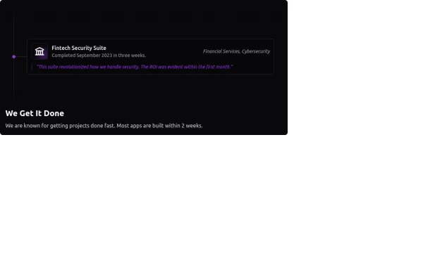 Fully Animated Timeline Card
It is at a 20s interval for testing purposes. Go to the <style> and change the .content-scroll class from 20s to 35s for a production ready slower animation.
1 year ago1.9k -
 Innovative Rwanda-Canada Transport Services Website
Innovative Rwanda-Canada Transport Services Website
5 months ago478 -
 2 months ago153
 -
 Profit Card
Profit card with deatils
1 year ago2.1k -
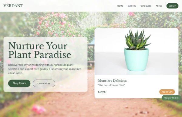 Garden
by salvator
8 months ago1.2k -
 7 months ago676


Explore components by Tags
Didn't find component you were looking for?
Search from 3000+ components