Responsive footer
Standard footer format
This tailwind example is contributed by Emre Yılmaz, on 05-Feb-2024. Component is made with Tailwind CSS v3. It is responsive.

Author Emre Yılmaz
Related Examples
-
 3 years ago15k
 -
 3 years ago11.5k
 -
 Responsive Website Footer
A modern and clean website footer component with sections for branding, navigation links, social media icons, and copyright text. Designed to be fully responsive and suitable for portfolios, business websites, and web applications.
3 months ago245 -
 Responsive eCommerce Footer Component with Tailwind CSS
A modern, fully responsive eCommerce footer component built with Tailwind CSS. It includes multiple sections like company info, account links, help center, categories, social media icons, payment methods, and app download buttons. Optimized for seamless mobile and desktop experiences, making it perfect for any online store or business website.
1 year ago1.2k -
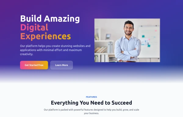 home page
Hero Section: Gradient background with noise texture Animated floating image Gradient text effect Call-to-action buttons Features Section: Three feature cards with gradient headers Hover animations Clean iconography Stats Display: Full-width gradient background Clean stat presentation Testimonials: Three testimonial cards with user avatars Star ratings Border accents Hover scaling effects Call-to-Action (CTA) Section: Gradient background Centered content Multiple action buttons Footer: Four-column layout Social media icons Newsletter signup Copyright information Design Features: Vibrant gradient color scheme Smooth hover animations and transitions Responsive layout for all screen sizes Modern typography Subtle floating animations Clean, card-based design
10 months ago1.1k -
 2 years ago6.7k
 -
 Newsletter form with Pre-footer CTA
Get started with this example with a CTA section before the footer, a sitemap links, the logo of your brand, a newsletter sign-up form, and the copyright notice.
1 year ago2.7k -
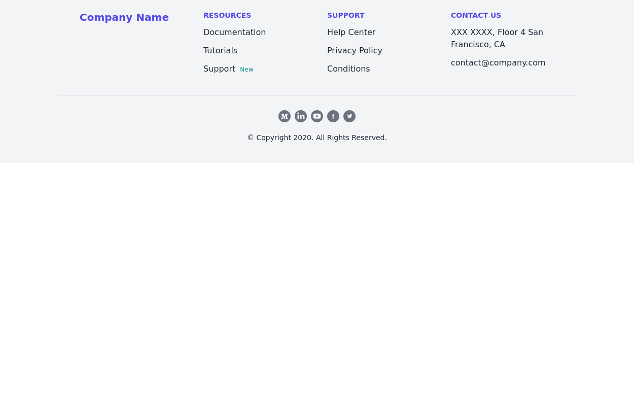
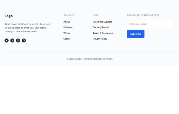
 Standard footer
You can use this example for five column footer with social media accounts, sitemap links, copyright notice and brand logo.
1 year ago2.8k -
 9 months ago587
 -
 1 year ago1.8k
 -
 Premium High-Performance Web Gaming Hub
Experience the future of browser-based gaming. I’ve developed a premium arcade hub designed for speed, clarity, and zero-latency gameplay. Built with modern web technologies, Ayyamperumal Games brings AAA-inspired visuals and high-octane mechanics directly to your browser—no downloads, no lag, just pure performance. Explore a curated library of titles ranging from minimalist logic puzzles like Sudoku Elite to fast-paced action in Neon Drift. This is where clean code meets high-level entertainment.
2 months ago424 -
 11 months ago1.2k


Explore components by Tags
Didn't find component you were looking for?
Search from 3000+ components