SCROLL ABAJO
para poner que a llegado al final de la pagina
This tailwind example is contributed by Raul antonio de la cruz hernandez, on 11-Aug-2025. Component is made with Tailwind CSS v3. It is responsive. similar terms for this example are Content loader, Shimmer, Ghost element, Content placeholder

Related Examples
-
 Playstore Button
Download on the play store button
3 years ago15.1k -
 button
Background Studio
2 months ago326 -
 Plug and Play Button - Animated gradient background
Know errors: You may need to remove animate-spin for your usecase, depending on framework rendering. For SvelteKit, animate-spin is NOT needed. But the [animation:spin_4s]... is always necessary for a smooth effect. Check out my profile to join my community online or add me on LinkedIn.
1 year ago2.1k -
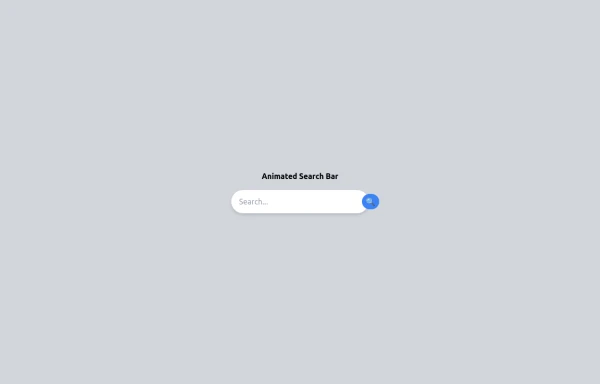 Animated Search bar
Animated Search bar using tailwind
9 months ago1.1k -
 Boutons iOS 26
Boutons iOS 26
3 months ago591 -
 Tab Menu
Tab menu
2 years ago6.6k -
 3 years ago16.5k
 -
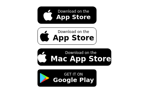 Store buttons (apple,google play)
apple, google play store buttons
3 years ago15.2k -
 Buttons popup on hover
Popup buttons on hover
3 years ago14.6k -
3 years ago14.6k
-
 Ripple Button
Ripple Button is an interactive button component with a ripple animation that responds to user clicks
2 years ago13.6k -
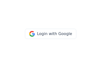 Google login/signup button
Styled button designed for users to log in or authenticate using their Google account. The button features a Google logo (represented by an SVG image) on the left and the text "Login with Google" on the right.
2 years ago40.7k


Explore components by Tags
Didn't find component you were looking for?
Search from 3000+ components