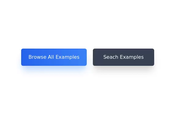
Plug and Play Button - Animated gradient background
Know errors: You may need to remove animate-spin for your usecase, depending on framework rendering. For SvelteKit, animate-spin is NOT needed. But the [animation:spin_4s]... is always necessary for a smooth effect.
Check out my profile to join my community online or add me on LinkedIn.
This tailwind example is contributed by Coastal UI, on 05-Nov-2024. Component is made with Tailwind CSS v3. It is responsive. It supports dark mode.

Author Coastal UI
Related Examples
-
 Button with hover to button shadow
A beautiful button with a special shadow
1 year ago1.6k -
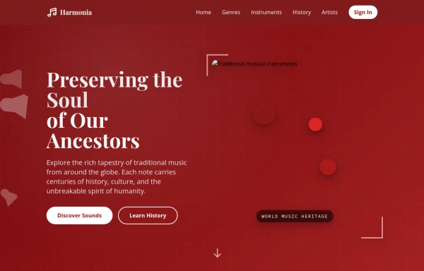 tradition music
by salvator
9 months ago862 -
 3 years ago10.9k
 -
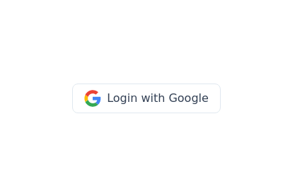 Google login/signup button
Styled button designed for users to log in or authenticate using their Google account. The button features a Google logo (represented by an SVG image) on the left and the text "Login with Google" on the right.
2 years ago40.5k -
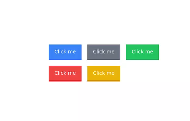
 Button
Button with scale animation on hover and translate-y on active
2 months ago80 -
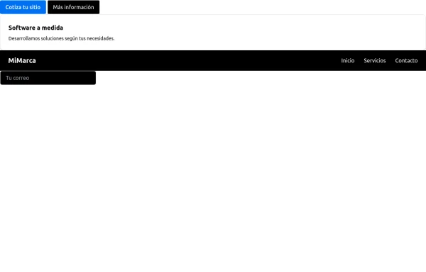 Componentes para mi empresa
para mi empresa
10 months ago1.1k -
 Glowing gradient button
Button on black background
2 years ago12.6k -
 1 year ago2.8k
 -
 3 years ago12.4k
 -
Button wih hover gradient
Works well with the dark theme
2 years ago18.3k -
 3 years ago12.8k
 -
 3 years ago16.1k


Explore components by Tags
Didn't find component you were looking for?
Search from 3000+ components