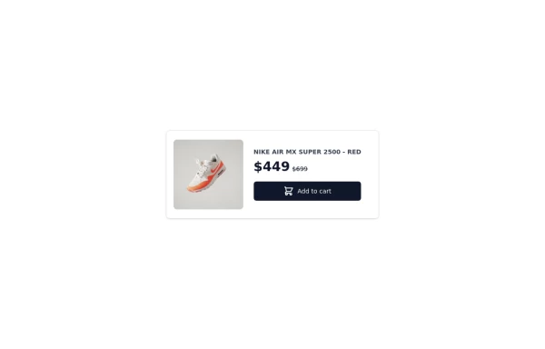
card simple
This tailwind example is contributed by Raul antonio de la cruz hernandez, on 03-Feb-2026. Component is made with Tailwind v3.4. It is responsive.

Related Examples
-

-
 2.1k
-
 Card
Card
2.2k -
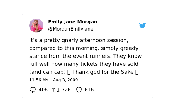 Twitter tweet clone
Replica of twitter tweet card
10.4k -

-
 Ripple Animation
Component is made with Tailwind CSS v3. It is responsive. It supports dark mode. similar terms for this example are loading, loader,Author box, User information,Transitions
795 -
-
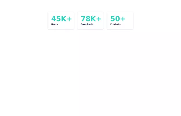 Info cards
Show various statistics on your website
12.1k -
 Linear dinamique section by Raul antonio de la cruz hernandez remix omerlinx responsive
-
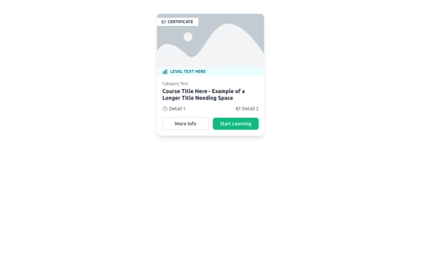 E-Learning Course Card with Badge and Level Indicator
An HTML and Tailwind CSS component mockup for displaying course information. Features include a placeholder image area with an overlaid certificate badge, a distinct level indicator banner below the image, category text, a course title, key details (like duration and learner count placeholders), and primary/secondary action buttons. Designed for e-learning platforms or course listings.
1.6k -
 Card-Product
Product card for vertical windows, if you need a more complete version to show more information, you have other options in my profile
3.4k -
 Personal card
A card to show minimal info for staff member
1.8k






Browse by topic
Explore components by Tags
Jump straight to the UI pattern you need.
Can't find it?
Didn't find the component you were looking for?
Search across 3,000+ community-built components and grab the code in seconds.