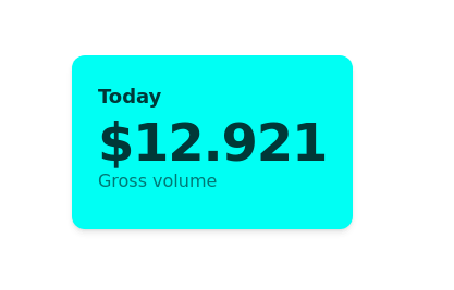
Card
Simple Card
This tailwind example is contributed by Anonymous, on 09-Apr-2025. Component is made with Tailwind CSS v3. It is responsive. It supports dark mode.

Author Anonymous
Related Examples
-
 Card Product
Card Product for List Product
2 months ago87 -
 3 years ago10.3k
 -
 3 years ago11.1k
 -
 Minimal Card
This is awesome looking card
1 year ago2.8k -
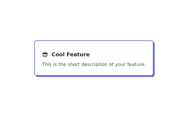 Feature Card
Elevated card
3 years ago10.6k -
 Expandable Card
An expandable card using tailwind + alpine to show additional information when it is open
5 months ago496 -
 Avtar Cards
this is cards, for the profile section
8 months ago402 -
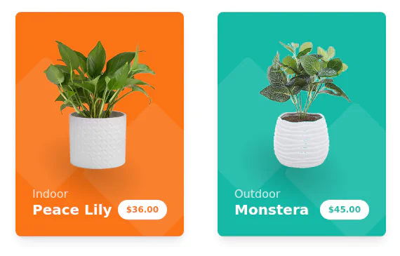 Products cards w/ hover effect
Example of product card grid with product image, pricing and a hover effect FORKED FROM: https://tailwindflex.com/noob_dev/products-card-grid
2 years ago19.4k -
 9 months ago406
 -
 6 months ago515
 -
 multiple pricing cards
basic pricing card with single price
2 years ago12.8k -
 3 years ago12.3k


Explore components by Tags
Didn't find component you were looking for?
Search from 3000+ components