Inventory
management
This tailwind example is contributed by Ramkesh Gupta, on 25-Oct-2025. Component is made with Tailwind CSS v3. It is responsive.

Author Ramkesh Gupta
Related Examples
-
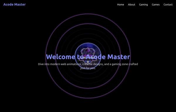 AcodeMaster GameZone – Play Your Favorite Games Online
AcodeMaster GameZone is a modern gaming website where you can discover, explore, and play exciting games anytime, anywhere. Designed with smooth animations and a stylish dark theme using Tailwind CSS, it offers a fast and fun experience for every gamer.
9 months ago1.1k -
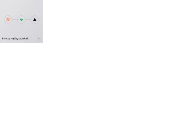 Animated bento box.
A Coastal UI component (coastalui.com). This can be used as part of a bento box, great for showing connectivity between context, could be used beyond just showing tech stacks.
11 months ago1.4k -
 11 months ago1k
 -
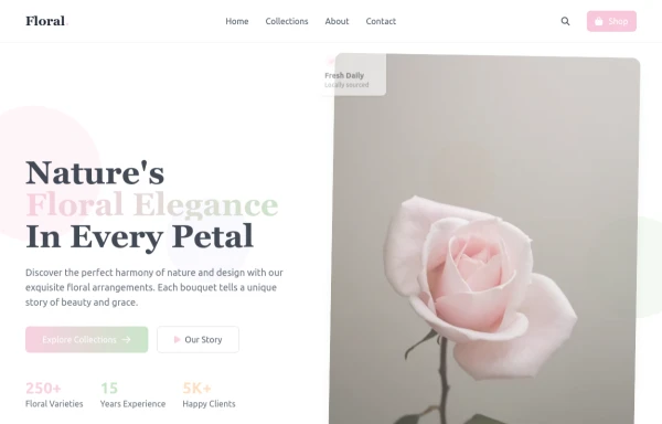 flower
by salvator
9 months ago1.4k -
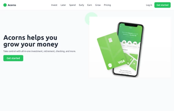 Digital banking hero
Create a professional and trustworthy hero section for a banking landing page using TailwindCSS. This section features a bold, confidence-inspiring headline, a clear subheading emphasizing security and ease of banking, and a call-to-action button for account sign-ups or exploring services. With a modern, clean design, a background that reflects stability and innovation, and visually appealing elements, this hero section establishes credibility and trust. Ideal for online banking, fintech startups, and financial institutions, ensuring a seamless and engaging user experience.
1 year ago1.8k -
Advance Designed hero section
We create a Advance animated hero section using tailwindcss and custom css
1 year ago2.3k -
 1 year ago2k
 -
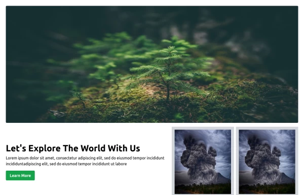
 Full-page header for landing pages
an attention-grabbing header with a strong message and clear calls to action.
2 years ago11.9k -
 1 year ago2.1k
 -
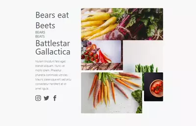 bears/beats/battlestar gallactica
bears beats battlestar gallactica
2 years ago9.7k -
 1 year ago1.4k
 -
 8 months ago671


Explore components by Tags
Didn't find component you were looking for?
Search from 3000+ components