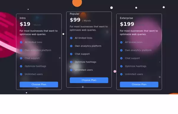
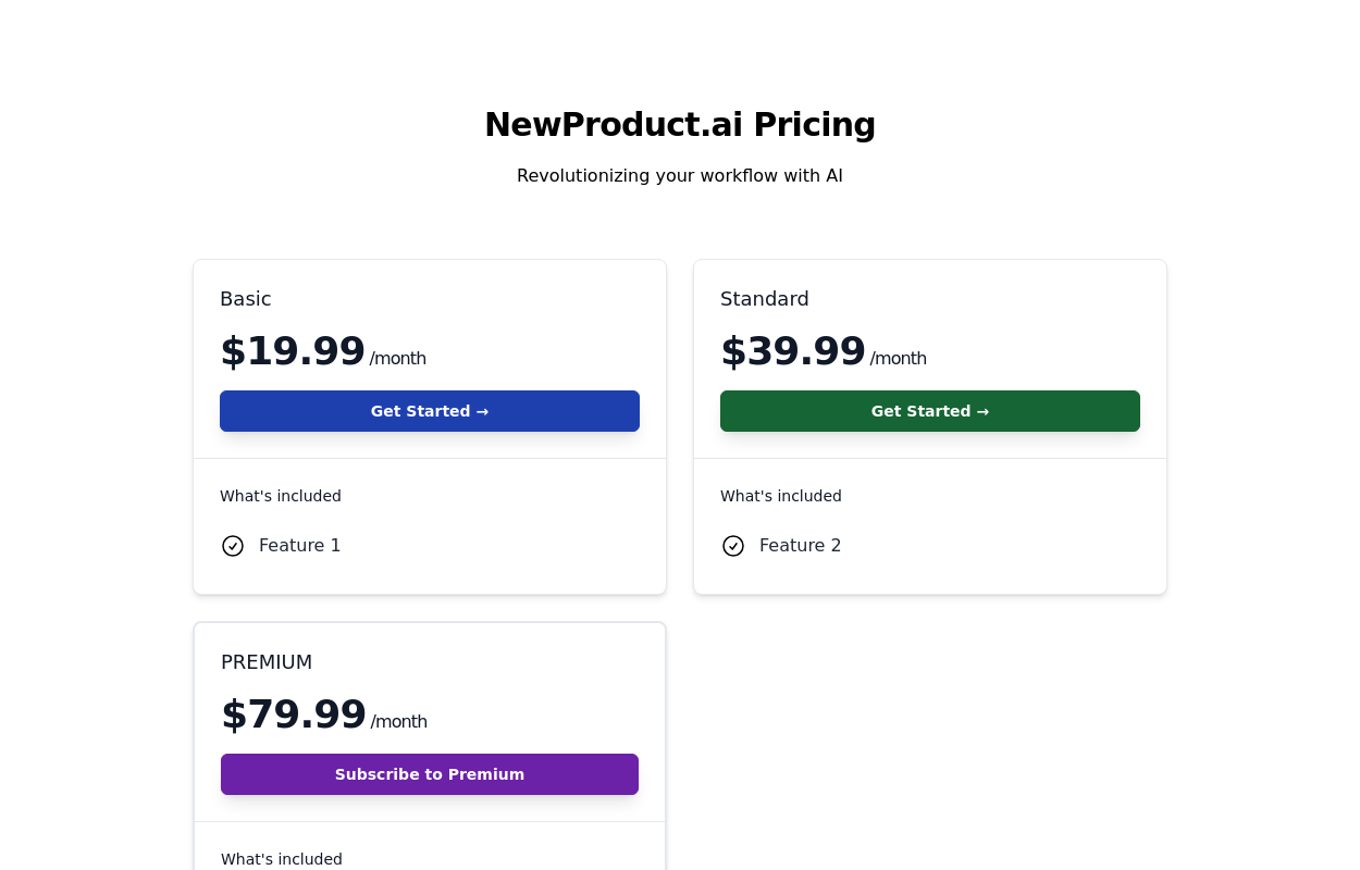
Pricing Card
A responsive pricing card build using html and tailwind css
This tailwind example is contributed by Rajesh Maheshwari, on 27-Feb-2025. Component is made with Tailwind CSS v3. It is responsive. similar terms for this example are Service rates, Subscription plans

Author Rajesh Maheshwari
Related Examples
-
 2 years ago9.3k
 -
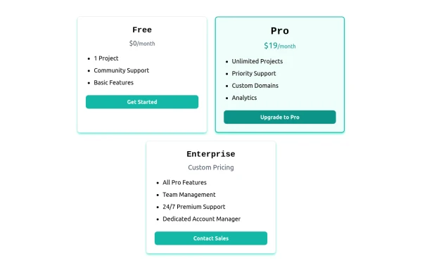 Card pricing section
Absolutely! Here's a beautiful 3-card pricing section using Tailwind CSS, with animations, dark mode support, and clearly differentiated plans (Free, Pro, and Enterprise).
8 months ago824 -
 MENU OMERLINKS
MENU OMERLINKS
1 month ago143 -
 Pricing Plan Selector
radio buttons for selecting a pricing plan
1 year ago3.8k -
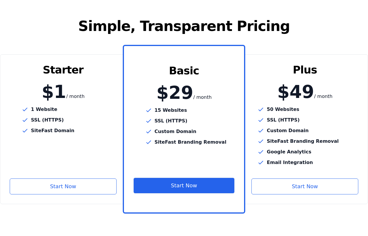
 Pricing section - Htmlwind
Single pricing
9 months ago722 -
 3 years ago9.2k
 -
 "Visit Rwanda" tourism website focusing on wildlife, particularly mountain gorillas
Key Features of This Rwanda Tourism Website: Focus on Mountain Gorillas ("Ingagi"): Dedicated section highlighting gorilla trekking experiences Information about conservation efforts Booking options for gorilla permits Wildlife Showcase: Featured animals including gorillas, golden monkeys, elephants, lions, and more Beautiful image cards for each species Conservation-focused messaging National Parks Information: Sections on Volcanoes, Akagera, and Nyungwe National Parks Visual highlights of each park's unique features User Experience: Responsive design that works on all devices Attractive color scheme inspired by Rwanda's landscapes Easy navigation with clear calls-to-action Practical Information: Contact form for tour inquiries Testimonials from previous visitors Footer with important links and contact details
8 months ago851 -
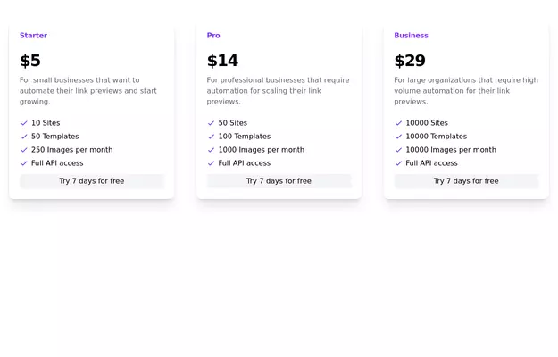
 Basic Pricing Cards
highlight and promote different product or service plans
2 years ago7.1k -
 3 years ago12.8k
 -
-
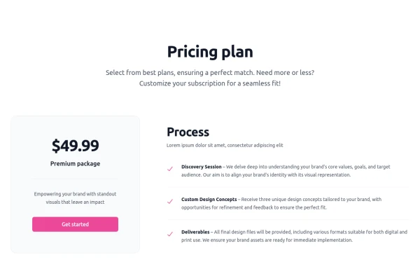
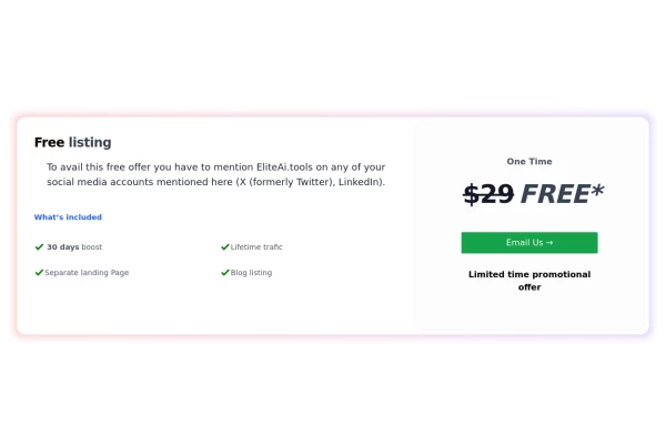
 Pricing section
Service/product pricing section
3 years ago13.1k -
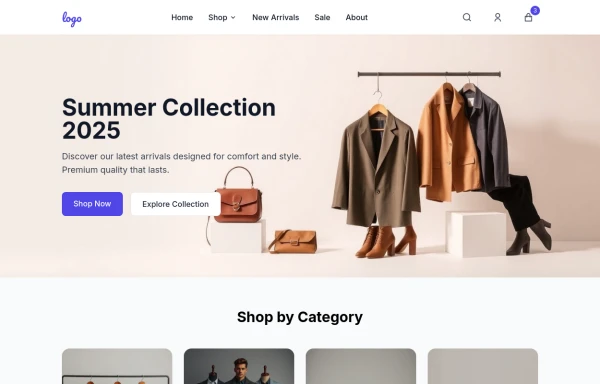 E-commerce Website UI Design
Here is a well-structured UI Design for a general e-commerce website template. This can be used as a reference for designers and developers to build or evaluate the UI components needed for an e-commerce site. View https://github.com/Rathanak-Phan/general-e-commerce-website-template
9 months ago2k


Explore components by Tags
Didn't find component you were looking for?
Search from 3000+ components