Footer
This tailwind example is contributed by Maxim, on 22-Mar-2025. Component is made with Tailwind CSS v3. It is responsive.

Author Maxim
Related Examples
-
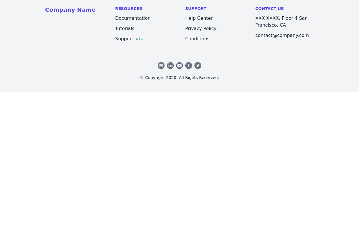
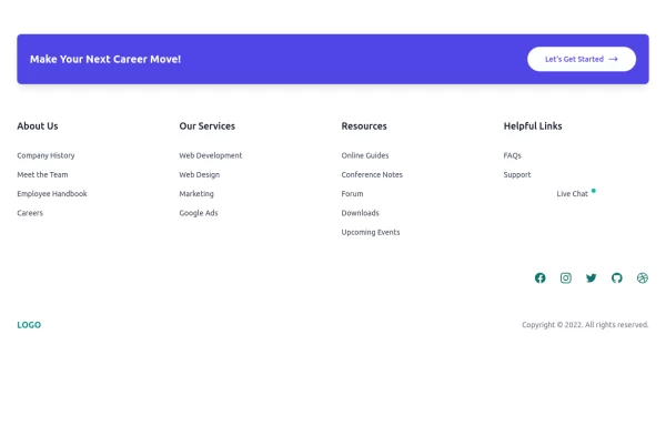 Clean & Responsive Footer Design with Tailwind CSS With CTA Button
modern and responsive footer built with Tailwind CSS to enhance website navigation, accessibility, and user experience. Featuring quick links, social media icons, copyright info, and a sleek layout, this SEO-friendly footer improves engagement and usability across all devices. Perfect for portfolios, business websites, and eCommerce stores!
10 months ago1k -
 Home page
Home page для ПО, страница для входа в приложение.
11 months ago1.3k -
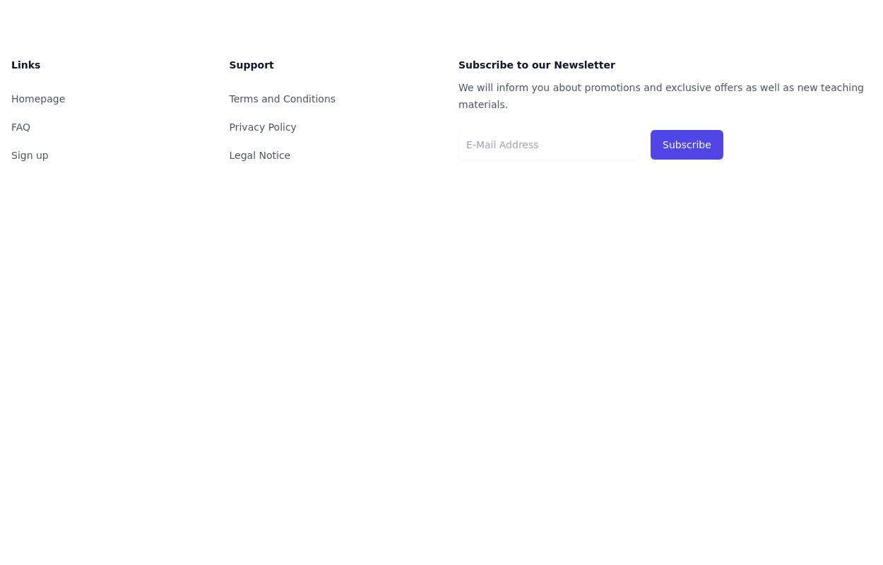
 Newsletter form with Pre-footer CTA
Get started with this example with a CTA section before the footer, a sitemap links, the logo of your brand, a newsletter sign-up form, and the copyright notice.
1 year ago2.7k -
 3 years ago10.8k
 -
 3 years ago14.1k
 -
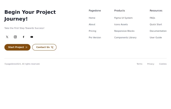 Creative with CTA buttons
Use Below tailwind css footer example with CTA buttons and site links.
1 year ago2.5k -
 3 years ago14.8k
 -
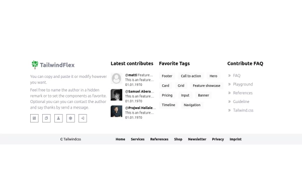 Footer, TailwindFlex v2
Another footer version of tailwindflex.com Example users randomly picked: Samuel & Prajwal
1 year ago1k -
 Tailwind Footer with dark version
This example can be used if you are looking for four column footer in dark version with sitemap links, brand logo, and social media accounts.
1 year ago3.6k -
 Responsive footer
Footer section with icons
3 years ago12.6k -
 Simple tailwind footer
Simple tailwind footer with newsletter
3 years ago10.3k -
 canvas fully covers
canvas fully covers
8 months ago827


Explore components by Tags
Didn't find component you were looking for?
Search from 3000+ components