Back to top button
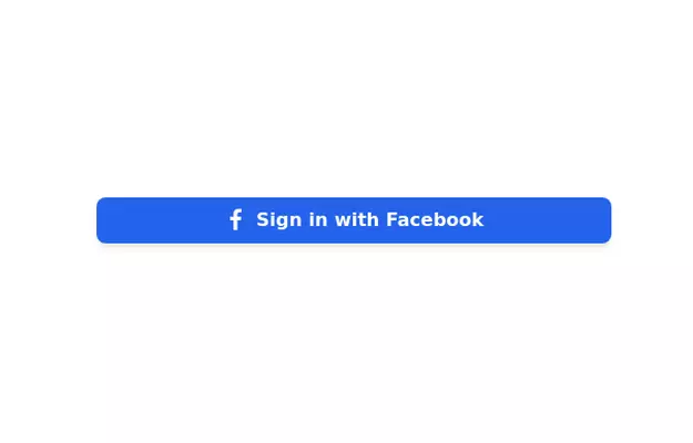
This tailwind example is contributed by Rafferty Kim, on 29-Jan-2023. Component is made with Tailwind CSS v3.

Author Rafferty Kim
Related Examples
-
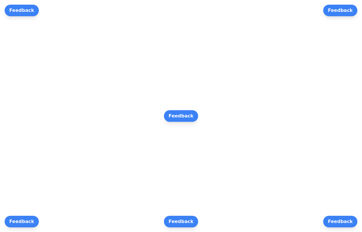 Floating buttons examples
Bottom-Right Corner, Bottom-Left Corner, Top-Left Corner, Top-Right Corner, Center, Bottom-Center
2 years ago25.8k -
3 years ago17.9k
-
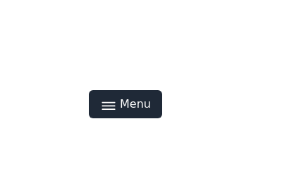
 Hamburger menu button with open/close animation
Open and close animation onclick requires alpineJs
3 years ago20.1k -
 3 years ago19.6k
 -
 2 years ago14.7k
 -
 3 years ago16.5k
 -
 3 years ago11.2k
 -
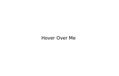 Underline Hover Effect
Hover effect using after and before pseudo elements.
2 years ago9.5k -
Plug and Play Animated Button for Hero Statements / Landing Pages
REMOVE the bg-black from the outside <button/> div, if you are already using a black background. Besides this, the button is plug and play! Know errors: You may need to remove animate-spin for your usecase, depending on framework rendering. For SvelteKit, animate-spin is NOT needed. But the [animation:spin_4s]... is always necessary for a smooth effect. Check out my profile to join my community online or add me on LinkedIn.
1 year ago2k -
 Premium Button Collection with 12 Unique Animations
Collection de 12 boutons premium avec animations uniques : glow, shine, slide, 3D push, neon pulse, glassmorphism, gradient border et plus. Chaque bouton a son propre effet hover. 100% Tailwind CSS, no JavaScript.
3 months ago417 -
 3 years ago12.1k
 -
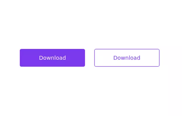 Primary and secondary button pair
Call to action buttons
3 years ago16.9k


Explore components by Tags
Didn't find component you were looking for?
Search from 3000+ components