Feature Showcase
Showcase Features of your product
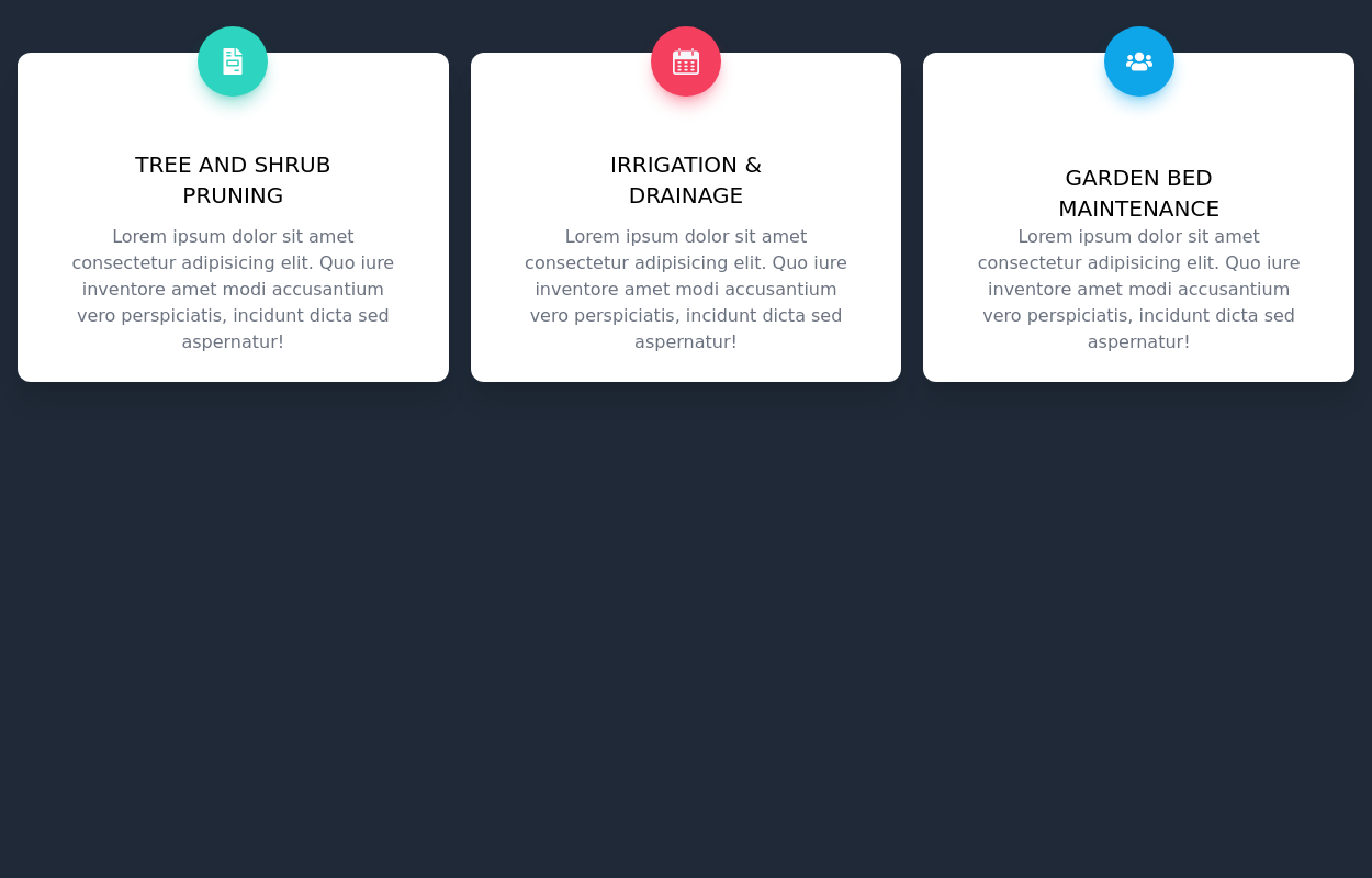
This tailwind example is contributed by Prashant, on 14-Sep-2022. Component is made with Tailwind CSS v3. It is responsive. similar terms for this example are Services,Why choose us

Author Prashant
Related Examples
-
 2 years ago17.2k
 -
 2 years ago14.4k
 -
 2 years ago14.4k
 -
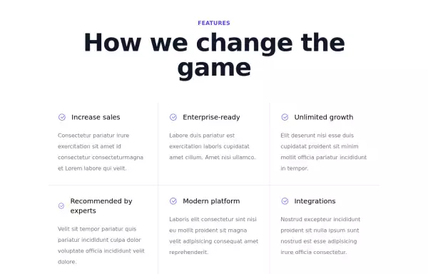
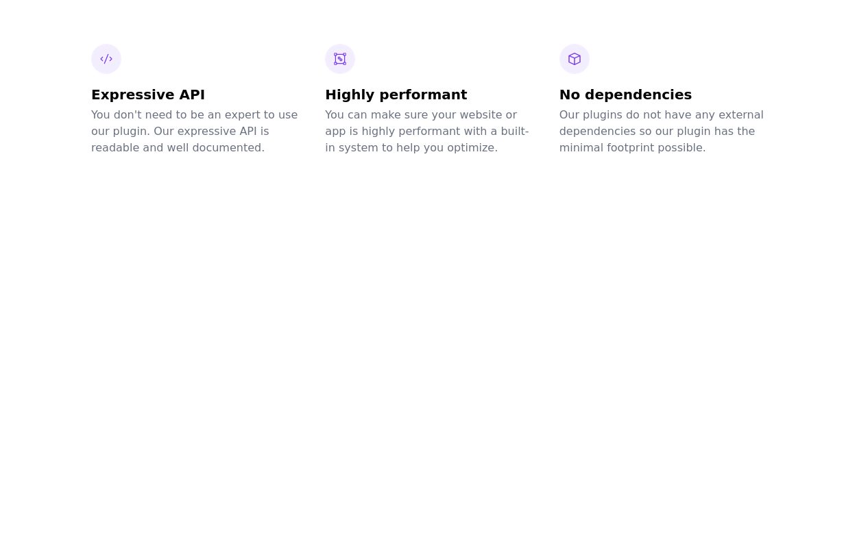
 Why choose us section
list your product features beautifully
2 years ago28.7k -
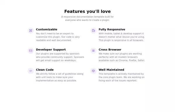
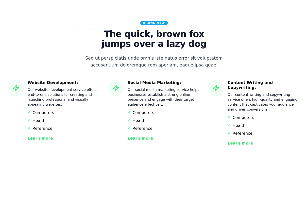
 tailwind services section
display features/services of your product
2 years ago20.8k -
 2 years ago10.1k
 -
 Product feature section
Showcase product features with an image
2 years ago14k -
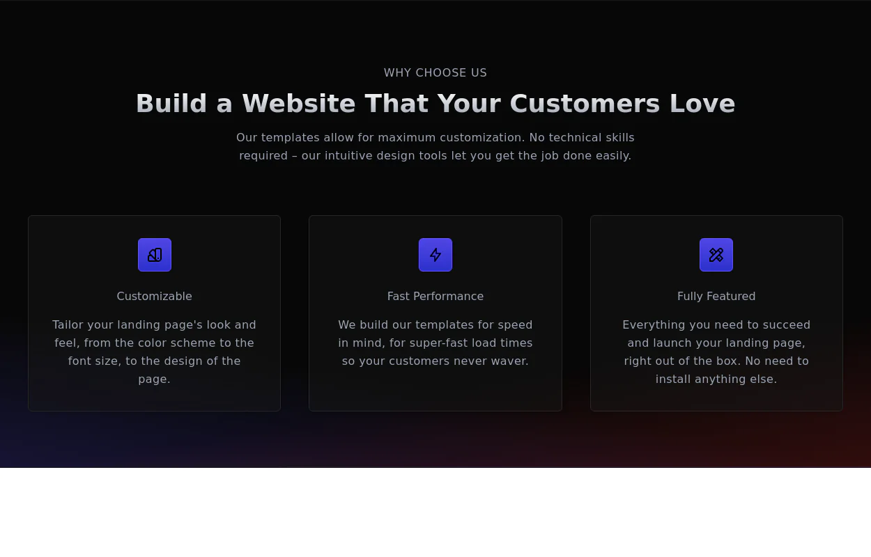
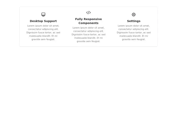 Responsive Features Section
It's a Handy Ready to Use Responsive Features or Services Component with Dark Mode
2 years ago5.3k -
 3 years ago11.2k
 -
 Showcase Your Services with Interactive Animations: A Modern HTML and Tailwind CSS Example
Discover how to create an eye-catching services section using plain HTML and Tailwind CSS. This modern example features interactive animations that bring your services to life. With smooth hover effects and responsive design, this section is perfect for enhancing your website's user experience. Easily customize the content to fit your needs, and let Tailwind CSS handle the styling and transitions for a polished, professional look.
1 year ago2.8k -
 1 year ago2.2k
 -
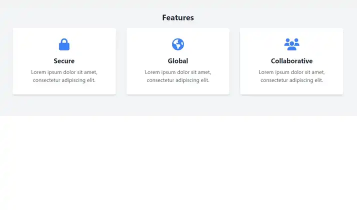
 Responsive Card Grid
Tailwind CSS responsive grid for feature listing. The cards have a teal background, rounded corners, and a concise display of feature titles, descriptions, and a "Learn More" link.
3 years ago52.2k


Explore components by Tags
Didn't find component you were looking for?
Search from 3000+ components