- Home
-
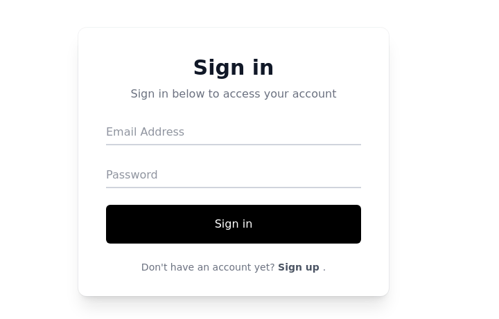
Sign-in form - Htmlwind
Simple login form
This tailwind example is contributed by Htmlwind, on 02-Jun-2025. Component is made with Tailwind CSS v3. It is responsive. similar terms for this example are Register, Sign in

Author Htmlwind
Related Examples
-
OTP Verification Page
A responsive and interactive OTP verification page built with Tailwind CSS. The page features a gradient background, hover effects, and animations to enhance user experience. It includes input fields for the OTP, a resend OTP link, and a verify button. The design is optimized for both light and dark modes.
5 months ago1.1k -
1 year ago1.7k
-
Profile Form
Enhanced User Profile Form with Stunning Profile and Cover Image Fields
2 weeks ago29 -
Login popup modal
centered modal for gaining more attention from users, it also has social login buttons.
1 year ago16.1k -
Login Form Component
The "Login Form Component" is a visually appealing and user-friendly interface designed for user authentication. It features a clean and well-structured layout with fields for entering the email address and password.
1 year ago7.9k -
1 year ago21.4k
-
1 year ago6.3k
-
Register Form
This is a simple Register Form component with dark mode supported and mobile responsive
1 year ago2.6k -
LOGIN TEMPLATE
it is a login template
1 week ago20 -
Login Form
Login Form
9 months ago1.6k -
Simple Sign-In Box
It features a backdrop blur effect on a dark background, creating an elegant and modern look.
1 year ago7.4k -
Registration Form
Color Updates: - Changed gradient background to `from-indigo-800 to-blue-900` - Updated text colors to `text-indigo-800` and `text-indigo-900` - Changed button colors to match the new theme - Updated focus rings to use indigo colors Enhanced Styling: - Added smooth transitions with `transition-all duration-300` - Improved shadow with `shadow-2xl` - Added hover scale effect on button - Increased border radius to `rounded-xl` - Added fade-in animation for the form Improved Validation: - Added visual feedback for invalid fields - Added input event listeners to clear error states - Added trim() to username and email validation - Added form reset after successful submission Accessibility Improvements: - Maintained proper contrast ratios - Kept focus states visible - Added proper spacing for better readability - Ensured all interactive elements are properly styled Added Interactions: - Smooth hover transitions - Scale animation on button hover - Immediate feedback on input - Clear error messaging
7 months ago1.6k
Explore components by Tags
Didn't find component you were looking for?
Search from 2400+ components